Layout (15)
GoScaffold
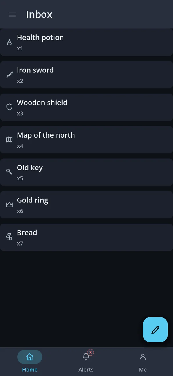
An app screen wired together: bar, scrolling page, bottom bar, FAB and drawer.
extends Control
var page := GoStyle.column()
var screen := GoScaffold.make("Inbox", page, true)
screen.set_fab(GoFab.make(GoIconSet.EDIT))
add_child(screen)
GoTopBar
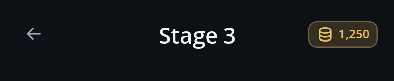
Items along the top edge in one to three slots; the centre stays centred.
extends GoEdgeBar
var bar := GoTopBar.make(3)
bar.add_start(GoStyle.icon_button(GoIconSet.BACK, go_back, -1, &"back"))
bar.add_center(GoStyle.label("Stage 3"))
bar.add_end(GoStyle.chip("1,250"))
GoBottomBar
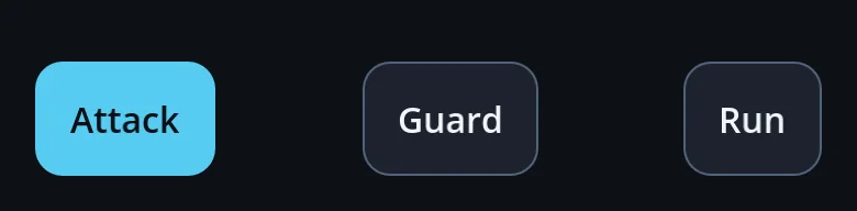
Items along the bottom edge, clear of the gesture bar.
extends GoEdgeBar
var actions := GoBottomBar.make(1, GoBottomBar.Justify.SPACE_BETWEEN)
for name in ["Attack", "Guard", "Run"]: actions.add_start(GoStyle.button(name))
screen.add_child(actions)
GoLeftSideBar
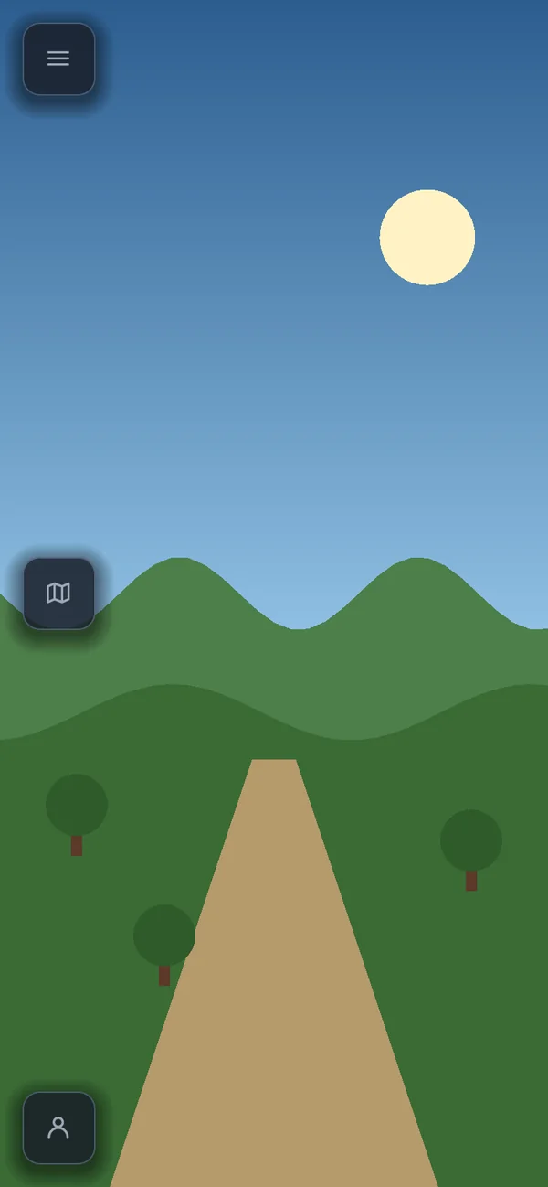
Up to three tiers down the left edge.
extends GoSideBar
var tools := GoLeftSideBar.make(3)
tools.add_start(GoStyle.icon_button(GoIconSet.MENU, open_menu, -1, &"menu"))
tools.add_end(GoStyle.icon_button(GoIconSet.USER, open_profile, -1, &"profile"))
screen.add_child(tools)
GoRightSideBar
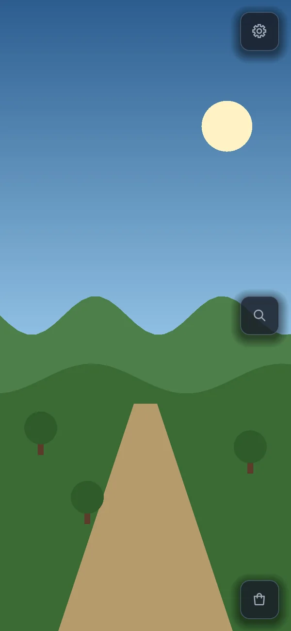
Up to three tiers down the right edge.
extends GoSideBar
var tools := GoRightSideBar.make(3)
tools.add_start(GoStyle.icon_button(GoIconSet.SETTINGS, open_settings, -1, &"settings"))
tools.add_center(GoStyle.icon_button(GoIconSet.SEARCH, find, -1, &"search"))
screen.add_child(tools)
GoSideBar
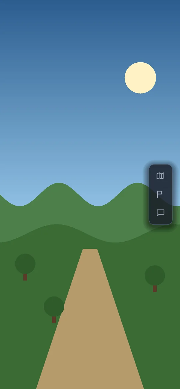
The side bar both of those are; it keeps its side in right-to-left languages.
extends GoEdgeBar
var rail := GoRightSideBar.make(1, GoSideBar.Justify.CENTER)
rail.add_start(GoStyle.icon_button(GoIconSet.MAP, open_map, -1, &"map"))
GoEdgeBar
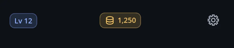
The rules every edge bar shares: slots, spreading, pinning to the edge, the safe area.
extends Container
var bar := GoTopBar.make(1)
bar.justify = GoEdgeBar.Justify.SPACE_BETWEEN
bar.pin_to_edge = GoEdgeBar.Pin.ALWAYS
GoGrid
Columns of exactly equal width — a fixed count, or as many as fit.
extends Container
var cards := GoGrid.make(1, 160.0)
for item in items: cards.add_child(GoStyle.item_card(item))
GoForm
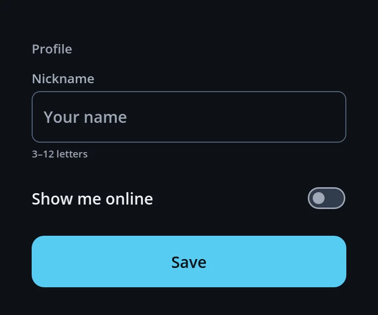
A form that caps its width and keeps clear of the keyboard and the HUD.
extends MarginContainer
var form := GoForm.new()
form.avoid_hud = true
form.add_child(GoScroll.new())
add_child(form)
GoScroll
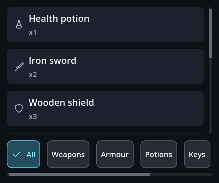
Touch scrolling that works from anywhere on the content; right-to-left aware.
extends ScrollContainer
var list := GoScroll.new()
list.add_child(GoStyle.column())
var strip := GoScroll.horizontal()
GoHudAnchor
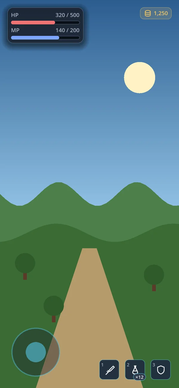
Pins HUD pieces to one of nine safe-area spots.
extends Control
var corner := GoHudAnchor.new()
corner.spot = GoHudAnchor.Spot.TOP_LEFT
corner.add_child(GoStyle.hud_panel())
GoStyle.column · row · wrap_row
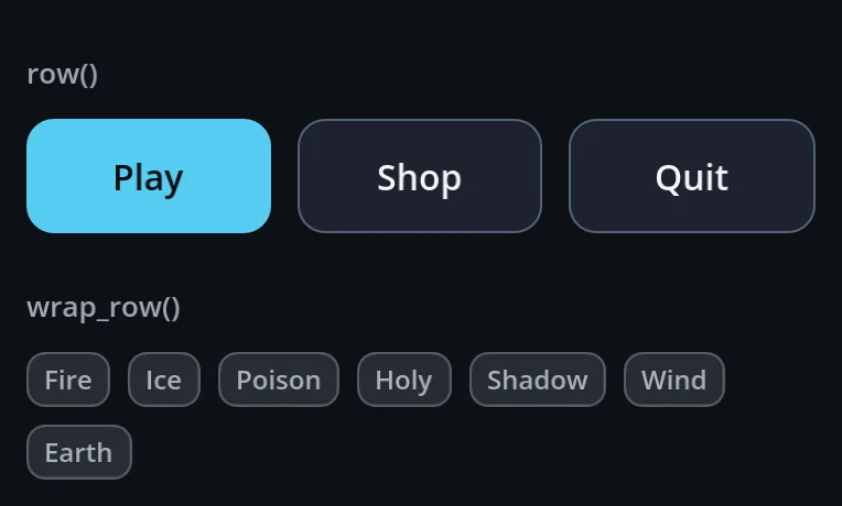
Columns, rows and wrapping rows with gaps from the theme.
a function of GoStyle
var page := GoStyle.column()
var line := GoStyle.row()
var chips := GoStyle.wrap_row()
GoStyle.responsive_grid · aspect
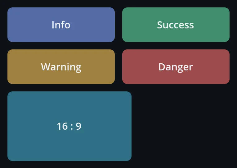
A grid that adds columns as it widens; a box that keeps its ratio.
a function of GoStyle
var tiles := GoStyle.responsive_grid(160)
var thumb := GoStyle.aspect(16.0 / 9.0)
GoStyle.padding · spacer · divider
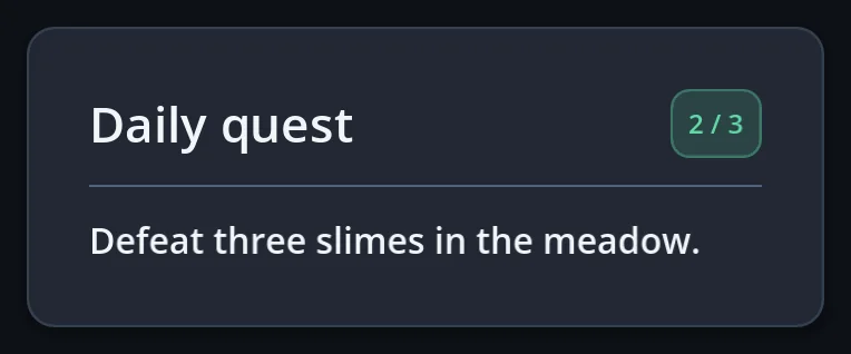
Padding, a spacer that takes the room left over, a divider line.
a function of GoStyle
var pad := GoStyle.padding(16)
line.add_child(GoStyle.spacer())
page.add_child(GoStyle.divider())
GoStyle.foldable · section
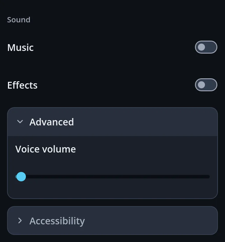
A section heading, and a section that folds open.
a function of GoStyle
page.add_child(GoStyle.section("Sound", false))
var more := GoStyle.foldable("Advanced", true, null, false)
Windows and overlays (12)
GoSurface
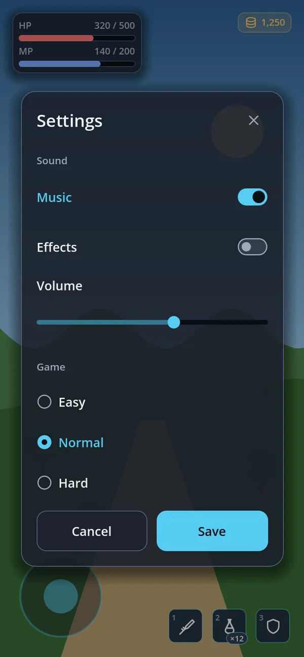
A floating window — centred, from the bottom, or anchored to a control.
extends Control
var window := GoSurface.new()
window.set_title("Settings")
window.close_requested.connect(window.queue_free)
layer.add_child(window)
GoSheet
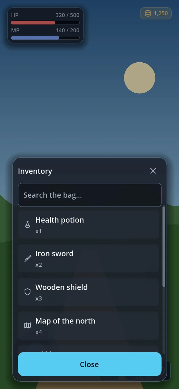
A bottom sheet with pages, back navigation and a sticky footer.
extends CanvasLayer
var sheet := GoSheet.new()
add_child(sheet)
sheet.open("Inventory")
sheet.body.add_child(bag_list)
GoPage
A full-screen page with a category rail (left in landscape, tabs on top in portrait), a preview, back, and sub-pages pushed inside it.
extends CanvasLayer
var page := GoPage.new()
add_child(page)
page.open("Settings")
page.set_tabs([{id = &"sound", label = "Sound", icon = GoIconSet.VOLUME_HIGH, badge = ""}])
page.push("About", func(box: VBoxContainer) -> void: box.add_child(GoStyle.label("Version 1.0")))
GoDialogs
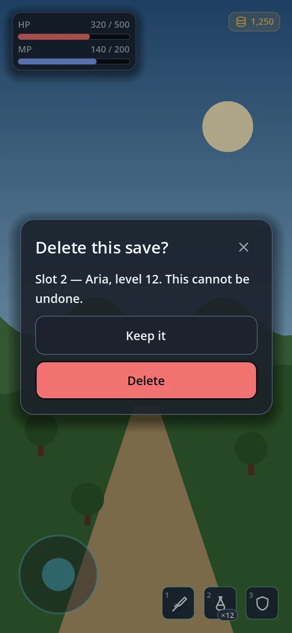
Confirm and alert windows you await; alerts wait their turn.
extends Node
var dialogs := GoDialogs.new()
add_child(dialogs)
if await dialogs.confirm("Delete save", "This cannot be undone.", "", "", "", {}, true):
	delete_save()
GoDialogs.choose
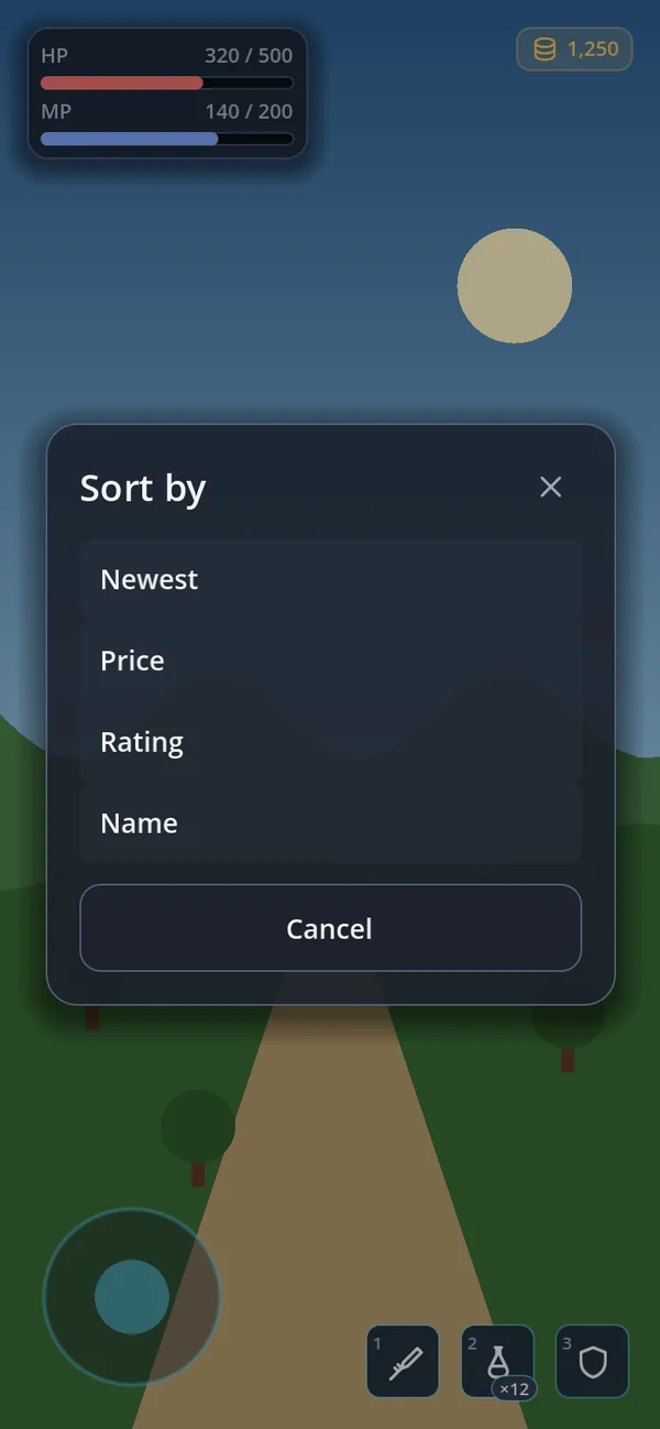
One of a few options — a bottom sheet on a phone, a card on a desktop.
a function of GoDialogs
var index := await dialogs.choose("Sort by", ["Newest", "Price", "Rating"])
if index >= 0: sort_by(index)
GoDrawer
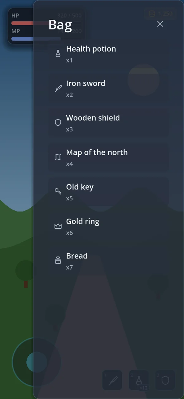
A panel that slides in from the left or the right.
extends CanvasLayer
var drawer := GoDrawer.new()
add_child(drawer)
drawer.side = GoDrawer.Side.RIGHT
drawer.open("Bag")
GoPopover
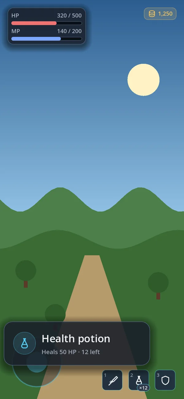
An info card beside what was pressed; one at a time.
extends RefCounted
GoPopover.open(slot, GoStyle.item_card(item, false)) GoContextMenu
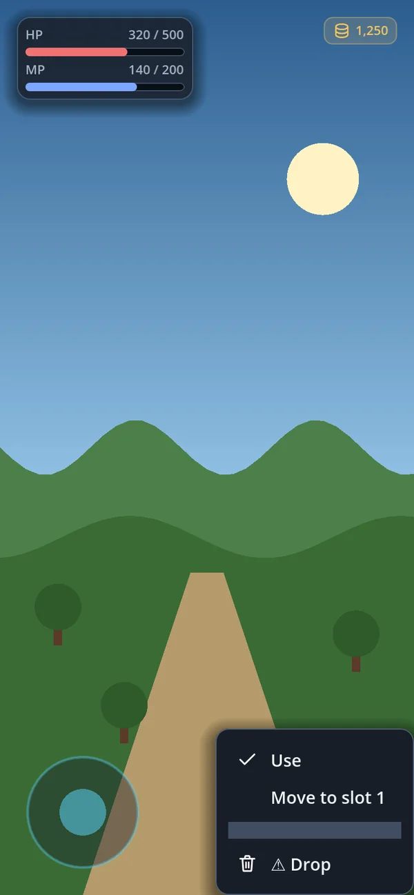
Long press or right click for a menu; a moving finger cancels it.
extends RefCounted
GoContextMenu.attach(slot, [{"text": "Use"}, {"text": "Drop", "danger": true}]) GoCoachMark
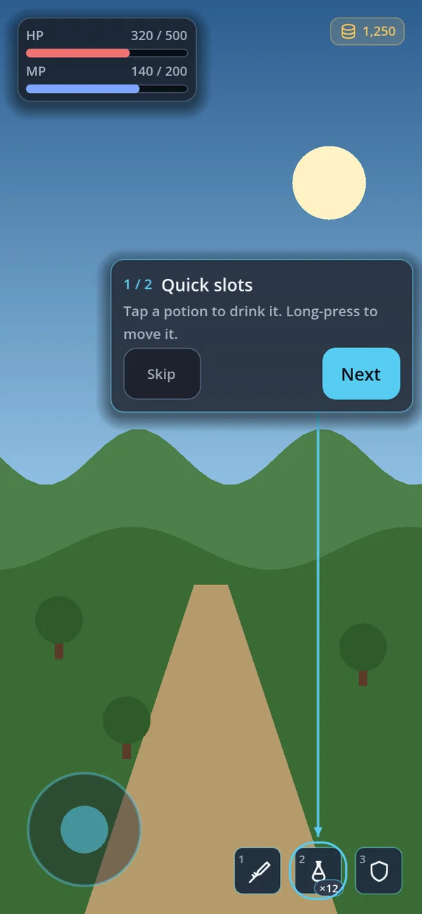
A guided tour that points at real controls.
extends Control
var tour := GoCoachMark.new()
add_child(tour)
tour.start([{"target": bag_button, "title": "Bag", "body": "Your items live here."}])
GoConsole
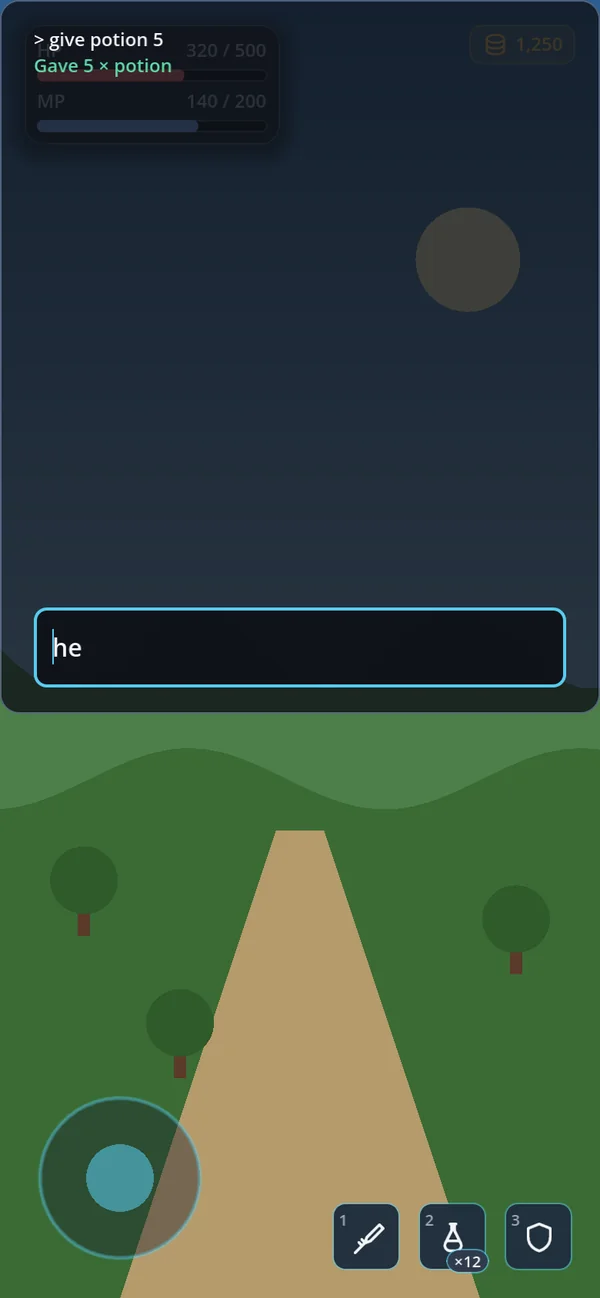
A developer console with commands and history; off in release builds.
extends CanvasLayer
var console := GoConsole.new()
add_child(console)
console.register("give", "Grant an item", give_item)
GoRibbonHeader
A screen's title ribbon hanging over the top of its card, with a glyph and the look's corner art.
extends Control
var header := GoRibbonHeader.make("PAUSED", GoIconSet.PAUSE)
card_column.add_child(header)
GoFitBox
Keeps a whole card on the screen, shrinking it with its ribbon when too big; a long list scrolls instead.
extends Container
var fit := GoFitBox.new()
fit.add_child(card)
Messages and waiting (12)
GoSnackbar
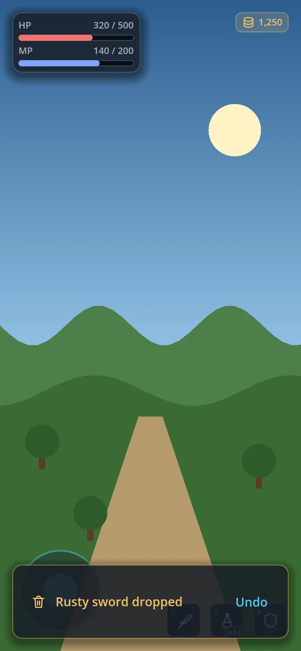
A message at the bottom that queues and can carry buttons.
extends Node
var snack := GoSnackbar.new()
add_child(snack)
if await snack.post({"text": "Item dropped", "actions": ["Undo"]}) == 0:
	restore_item()
GoNotice

A notice that never takes input or focus.
extends PanelContainer
var notice := GoNotice.new()
hud.add_child(notice)
notice.show_text("Saved", GoTheme.SUCCESS)
GoPromptCard
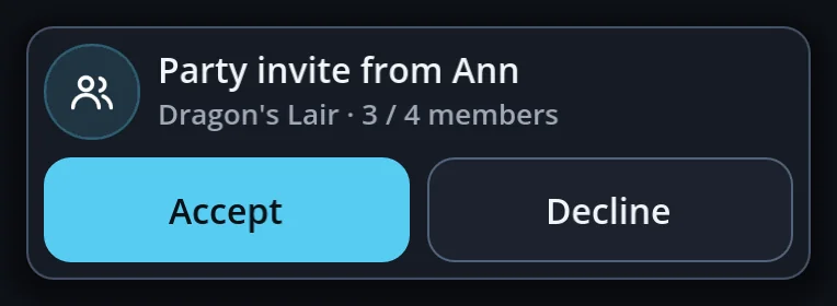
A question that does not stop the game — an invite, a trade.
extends PanelContainer
var invite := GoPromptCard.new()
invite.set_title("Party invite from Ann")
invite.set_actions([{"text": "Accept", "action": accept, "primary": true}])
GoBanner
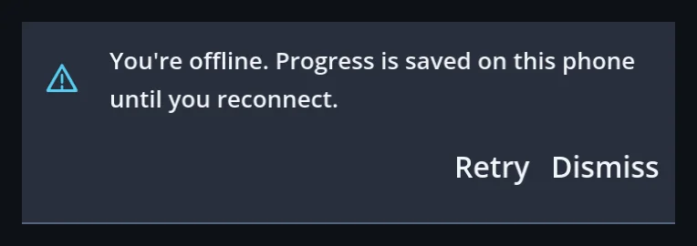
A message that stays on the page until it is dealt with.
extends PanelContainer
var offline := GoBanner.make("You're offline.", [{"text": "Retry", "action": reconnect}], GoIconSet.WARNING)
page.add_child(offline)
GoSpinner

A wait; turns a button into a spinner in place, so it cannot be pressed twice.
extends Control
GoSpinner.busy(buy_button, true)
await shop.buy(item)
GoSpinner.busy(buy_button, false)
GoBadge

The unread dot, the NEW tag and 99+, hung on a corner.
extends PanelContainer
GoBadge.attach(mail_button, unread)
GoBadge.attach(shop_button, 0, "NEW")
GoProgress
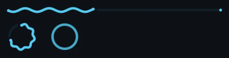
Progress as a line or a ring, wavy or flat; indeterminate while the size is unknown.
extends Control
var upload := GoProgress.linear()
upload.value = 0.4
var ring := GoProgress.circular(true)
GoLoadingIndicator

The Material 3 Expressive wait mark that changes shape; still under reduce_motion.
extends Control
var wait := GoLoadingIndicator.new()
wait.contained = true
page.add_child(wait)
GoRefresh
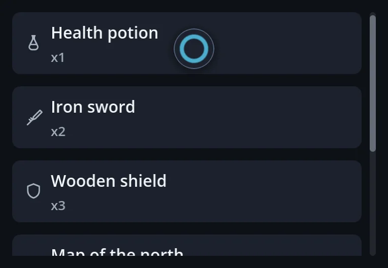
Pull a list down at its top to reload it.
extends Control
var refresh := GoRefresh.attach(feed)
refresh.refresh_requested.connect(func() -> void:
	await reload_posts()
	refresh.finish())
GoStyle.alert
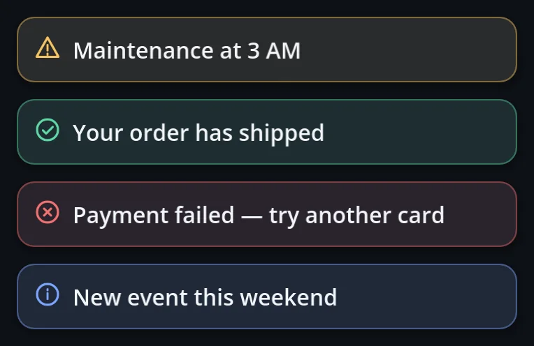
An inline message in the info, success, warning or danger tone.
a function of GoStyle
page.add_child(GoStyle.alert("Maintenance at 3 AM", GoTheme.WARNING)) GoStyle.skeleton · empty_state
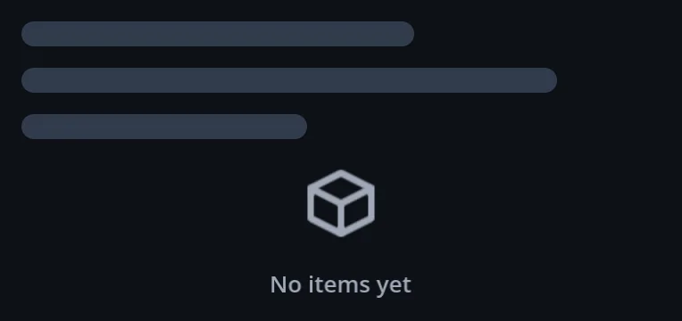
A placeholder while loading, and a message for an empty list.
a function of GoStyle
page.add_child(GoStyle.skeleton(200))
page.add_child(GoStyle.empty_state(GoIconSet.BOX, "No items yet", false))
GoStyle.tooltip_node
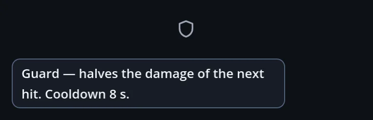
A tooltip in the theme's style that never splits its words.
a function of GoStyle
func _make_custom_tooltip(text: String) -> Object:
	return GoStyle.tooltip_node(text)
App navigation (13)
GoAppBar
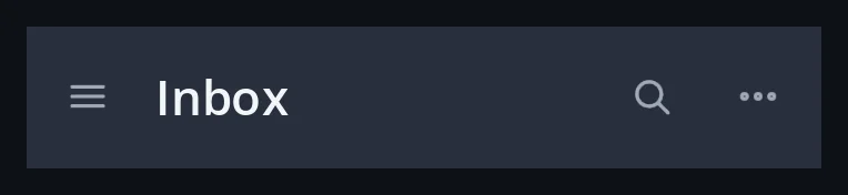
The top app bar; lifts when the page scrolls; medium and large titles.
extends PanelContainer
var bar := GoAppBar.make("Inbox", GoIconSet.MENU, open_drawer)
bar.add_action(GoIconSet.SEARCH, &"search", open_search)
bar.follow(list)
GoNavBar
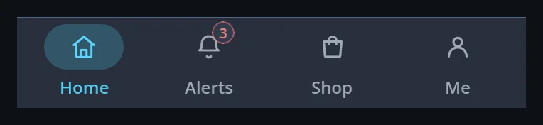
Three to five destinations along the bottom; a rail on wide screens.
extends PanelContainer
var nav := GoNavBar.make([{"icon": GoIconSet.HOME, "text": "Home"},
	{"icon": GoIconSet.BELL, "text": "Alerts", "badge": 3}], 0, show_tab)
var rail := GoNavBar.rail([{"icon": GoIconSet.HOME, "text": "Home"}])
GoNavBar.drawer_list
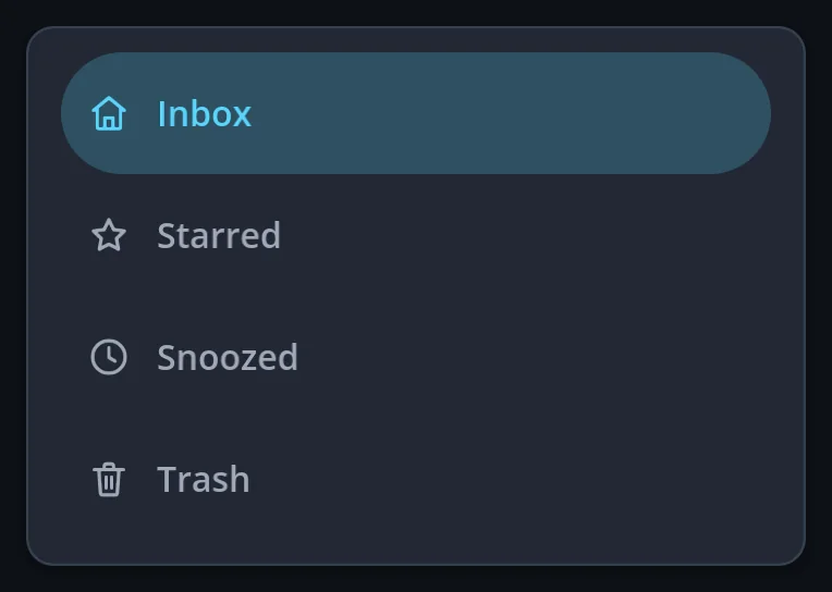
Full-width destination rows for a drawer.
a function of GoNavBar
drawer.body.add_child(GoNavBar.drawer_list([{"icon": GoIconSet.HOME, "text": "Inbox"},
	{"icon": GoIconSet.STAR, "text": "Starred"}], 0, go_to))
GoFab
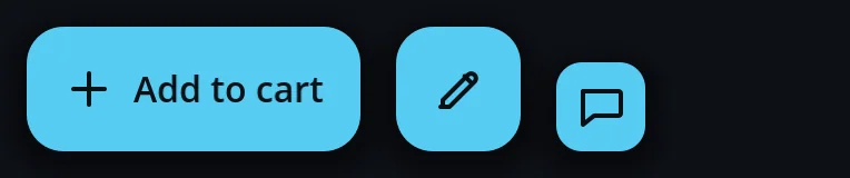
The screen's main action floating in the corner; 40–96dp or extended with a label.
extends Button
var cart := GoFab.make(GoIconSet.PLUS, "Add to cart", add_to_cart)
cart.float_in(self, nav.get_combined_minimum_size().y)
GoSearchBar
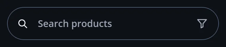
The rounded search field with a clear button and trailing actions.
extends PanelContainer
var search := GoSearchBar.make("Search products", find)
search.add_action(GoIconSet.FILTER, &"Filter", open_filters)
GoSplitButton
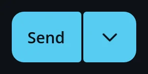
A main action with its variants behind an arrow.
extends HBoxContainer
var send := GoSplitButton.make("Send", send_now, ["Send later", "Save as draft"])
send.chosen.connect(func(index: int) -> void: send_variant(index))
GoTabView
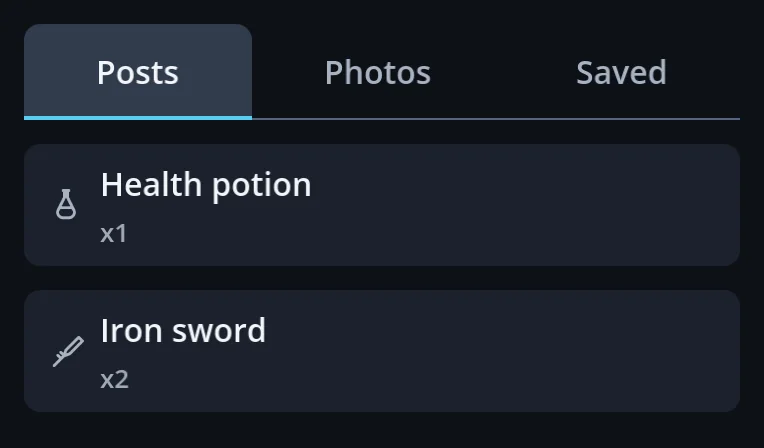
Tabs across the row over pages you swipe between.
extends VBoxContainer
var tabs := GoTabView.make(["Posts", "Photos", "Saved"], [posts, photos, saved])
tabs.tab_changed.connect(func(index: int) -> void: track_tab(index))
GoStyle.tabs
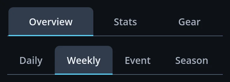
A tab row, at the start or spread over the row; the line runs the full width.
a function of GoStyle
var row := GoStyle.tabs(["Overview", "Stats", "Gear"], 0, false, true)
row.tab_changed.connect(show_panel)
GoStyle.bottom_app_bar
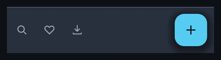
The bottom bar with icon actions and a FAB.
a function of GoStyle
screen.set_bottom_bar(GoStyle.bottom_app_bar([{"icon": GoIconSet.SEARCH, "tooltip": &"search"},
	{"icon": GoIconSet.HEART, "tooltip": &"Like"}], GoFab.make(GoIconSet.PLUS)))
GoStyle.toolbar
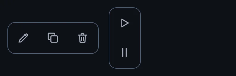
A floating pill of icon actions.
a function of GoStyle
page.add_child(GoStyle.toolbar([{"icon": GoIconSet.EDIT, "tooltip": &"Edit", "action": edit},
	{"icon": GoIconSet.TRASH, "tooltip": &"Delete", "action": delete}]))
GoStyle.breadcrumb
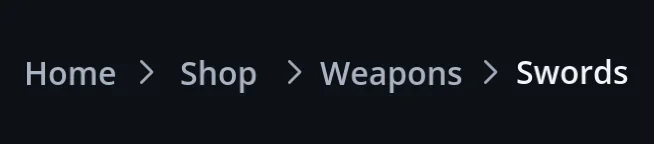
Where you are, as a path you can step back along.
a function of GoStyle
page.add_child(GoStyle.breadcrumb(["Home", "Shop", "Swords"], go_to_level)) GoPagination

Numbered pages that keep the current one centred, or a single Load more row.
extends HBoxContainer
var pages := GoPagination.make(1, 12, load_page)
page.add_child(pages)
GoCarousel
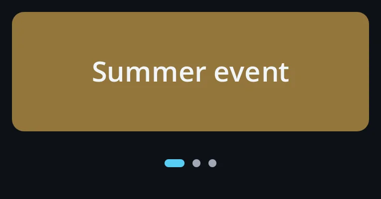
Banners and character select that never turn on their own unless asked.
extends VBoxContainer
var banners := GoCarousel.new()
banners.set_pages([promo, event, pack])
Buttons, chips and choices (10)
GoStyle.button
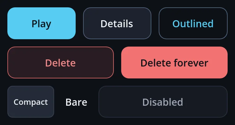
Buttons in seven tones: normal, primary, outlined, text, compact, danger and filled danger.
a function of GoStyle
row.add_child(GoStyle.button("Play", play, GoStyle.Tone.PRIMARY))
row.add_child(GoStyle.button("Details", open_details, GoStyle.Tone.OUTLINED))
row.add_child(GoStyle.button("Skip", skip, GoStyle.Tone.BARE))
GoStyle.glow

Raises a filled button with a glow.
a function of GoStyle
row.add_child(GoStyle.glow(GoStyle.button("Play", play, GoStyle.Tone.PRIMARY))) GoIconButton

An icon-only button: small to see, 48dp to touch, named for screen readers.
extends Button
row.add_child(GoStyle.icon_button(GoIconSet.CLOSE, close, -1, &"close"))
var bell := GoIconButton.new()
bell.icon_name = GoIconSet.BELL
GoGlyphButton
A button with a glyph right beside its label — the glossy pill of an arcade menu.
extends Button
row.add_child(GoGlyphButton.make("Play", GoIconSet.PLAY, GoTheme.VAR_PRIMARY_BUTTON)) GoStyle.chip
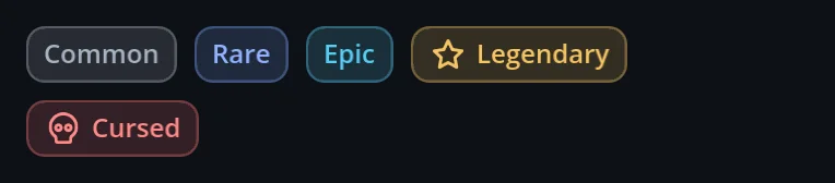
A status or tag pill whose text always reads.
a function of GoStyle
row.add_child(GoStyle.chip("Rare", GoUi.color(GoTheme.INFO))) GoStyle.filter_chip · input_chip
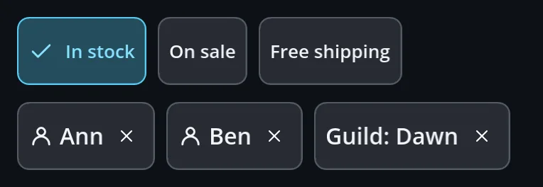
A chip that toggles, and an entered value with a ✕.
a function of GoStyle
filters.add_child(GoStyle.filter_chip("In stock", false, refilter))
to.add_child(GoStyle.input_chip("Ann", remove_ann, GoIconSet.USER))
GoStyle.segmented
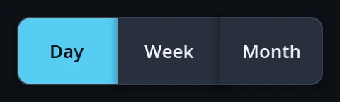
Exactly one of a few options, joined in a row.
a function of GoStyle
page.add_child(GoStyle.segmented(["Day", "Week", "Month"], 0, show_range)) GoStyle.choice_grid
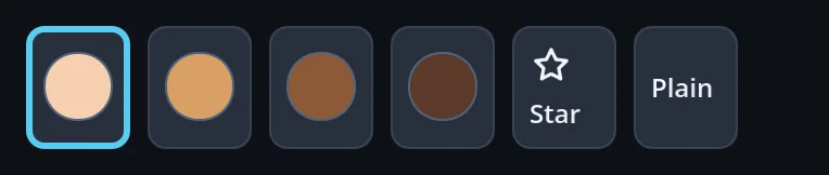
Pick one swatch — a colour, a skin — from a grid.
a function of GoStyle
var skins := GoStyle.choice_grid([{"color": "f6cfae", "tooltip": "Peach"},
	{"color": "8d5a36", "tooltip": "Cocoa"}], 0, pick_skin)
GoStyle.radio_group
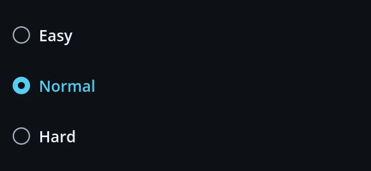
Radio buttons, one of which is chosen.
a function of GoStyle
page.add_child(GoStyle.radio_group(["Easy", "Normal", "Hard"], 1)) GoStyle.toggle · checkbox
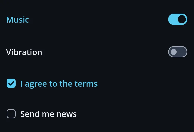
A switch and a check box with their labels.
a function of GoStyle
var music := GoStyle.toggle("Music", false)
var terms := GoStyle.checkbox("I agree to the terms", false)
Inputs and pickers (14)
GoStyle.line_edit · textarea
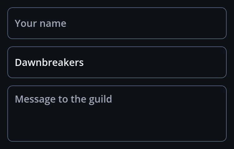
A one-line and a multi-line text field.
a function of GoStyle
var nickname := GoStyle.line_edit("Your name")
var note := GoStyle.textarea("Message", 4)
GoField
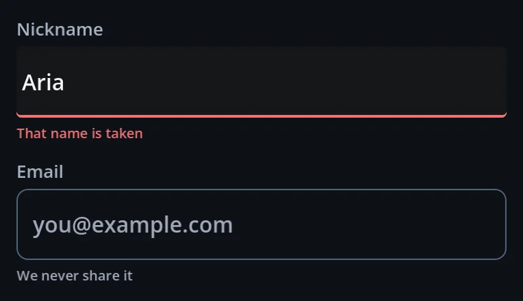
Label, control and hint, with an error under the field that is wrong.
extends VBoxContainer
var field := GoField.make("Nickname", GoStyle.line_edit(), "3–12 letters", false)
field.set_error("That name is taken")
GoInputGroup

An input and its buttons welded into one shape.
extends HBoxContainer
var chat := GoInputGroup.make(GoStyle.line_edit("Message"), {"suffix": GoStyle.button("Send", send)}) GoCombobox

A picker that searches inside names, not just from their start.
extends Button
var friend := GoCombobox.make(friends, -1, "Find a friend")
friend.picked.connect(invite)
GoCodeInput

Coupon and gift codes as cells; paste and IME input keep working.
extends VBoxContainer
var coupon := GoCodeInput.make(12, 4)
coupon.completed.connect(redeem)
GoStyle.select · dropdown

A drop-down list, and a button that opens a menu.
a function of GoStyle
var quality := GoStyle.select(["Low", "Medium", "High"])
var sort := GoStyle.dropdown("Sort", ["Newest", "Price"], sort_by)
GoStyle.slider
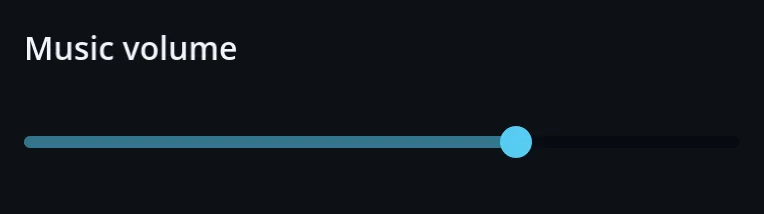
A slider in the theme's shape.
a function of GoStyle
var volume := GoStyle.slider(0.0, 1.0, 0.05)
volume.value_changed.connect(set_volume)
GoRangeSlider
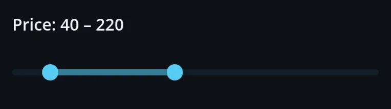
Two handles that never cross — a price or a level range.
extends Control
var price := GoRangeSlider.make(0.0, 500.0, 40.0, 220.0, 10.0)
price.change_ended.connect(func(low: float, high: float) -> void: refilter(low, high))
GoSlider
A slider drawn the painted way: the fill runs past the handle, a held handle grows.
extends HSlider
var music := GoSlider.make(0.0, 1.0, 0.01)
music.theme_type_variation = &"GoSliderGreen"
GoSwitch
An on/off switch drawn the painted way, with ON / OFF beside the knob.
extends CheckButton
var vibration := GoSwitch.make(true)
vibration.set_texts(tr("ON"), tr("OFF"))
GoDatePicker
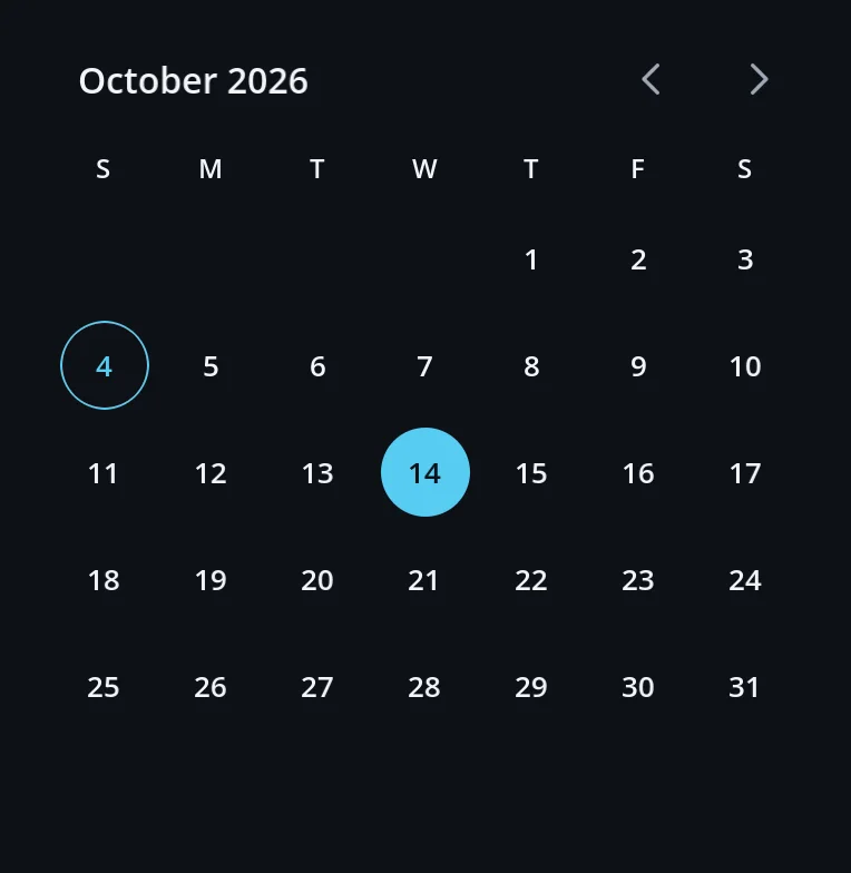
A month to tap; a range of days with range_mode.
extends Container
var stay := GoDatePicker.make()
stay.range_mode = true
stay.range_picked.connect(func(start: Dictionary, end: Dictionary) -> void: book(start, end))
GoTimePicker
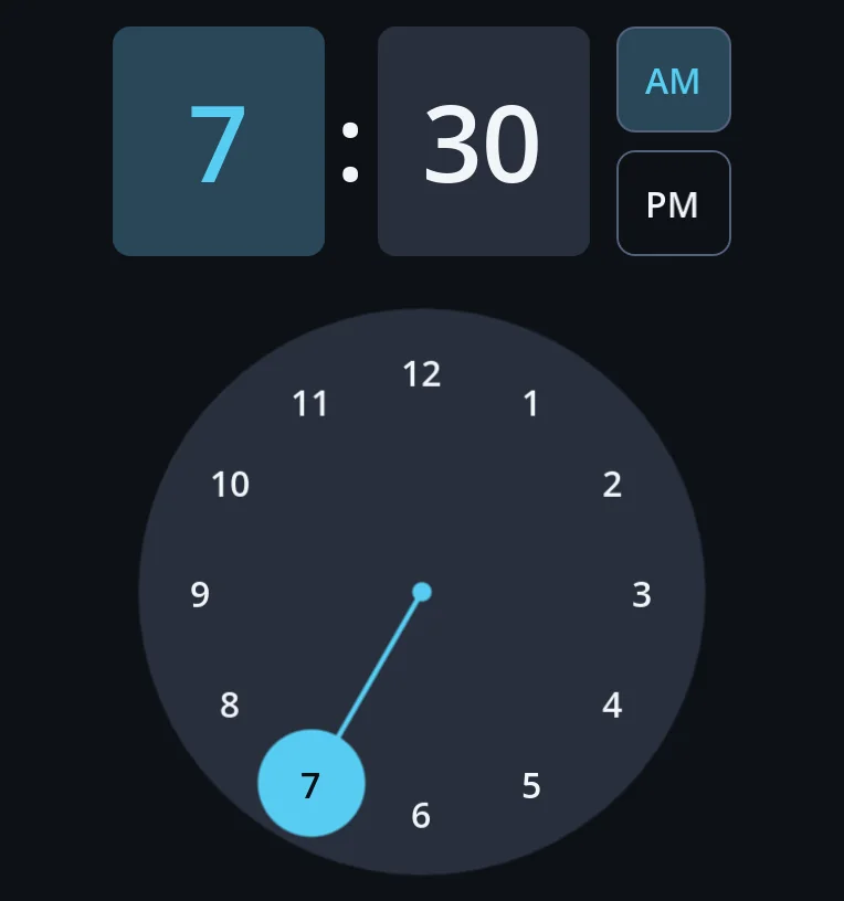
The clock dial: the hour, then the minutes; 12 or 24 hours; Up and Down on a box.
extends Container
var alarm := GoTimePicker.make(7, 30, func(hour: int, minute: int) -> void: set_alarm(hour, minute))
alarm.use_24h = true
GoWheelPicker
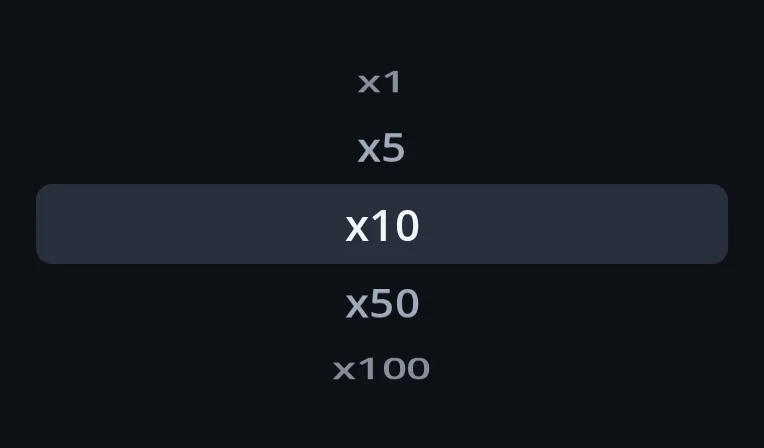
A wheel that spins and settles one item on its band.
extends Control
var amount := GoWheelPicker.make(["x1", "x5", "x10", "x50"], 0, set_amount)
row.add_child(amount)
GoStepper
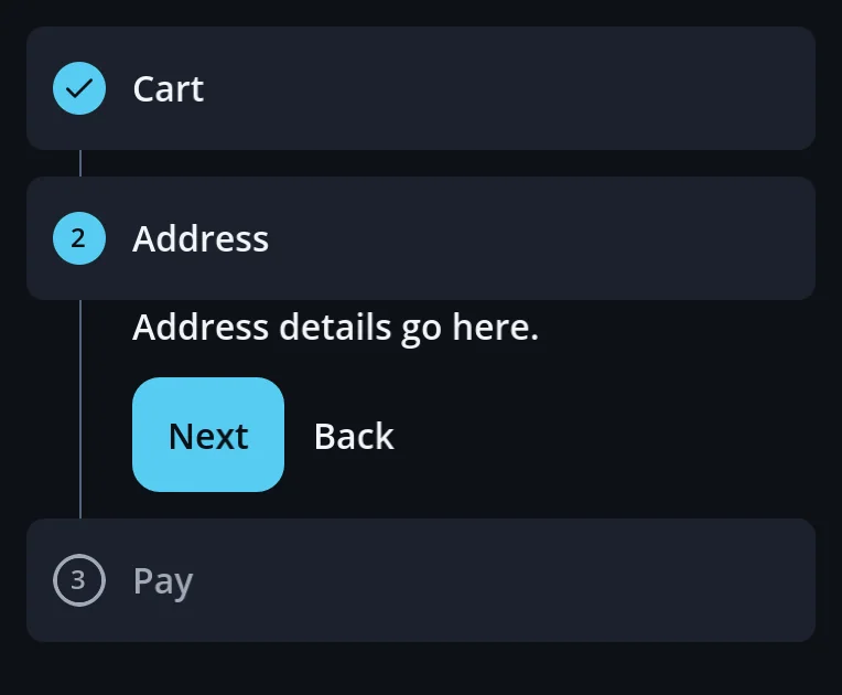
Numbered steps with Next and Back, down the page or in a row.
extends VBoxContainer
var checkout := GoStepper.make([{"title": "Cart", "content": cart}, {"title": "Pay", "content": pay}])
checkout.finished.connect(place_order)
Lists, cards and data (8)
GoStyle.list_row · list_button
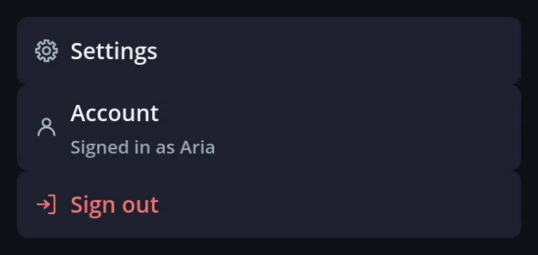
A list row with an icon, a title, a summary and a trailing mark.
a function of GoStyle
page.add_child(GoStyle.list_button(GoIconSet.SETTINGS, "Settings", open_settings, Color.TRANSPARENT, "", false)) GoListView
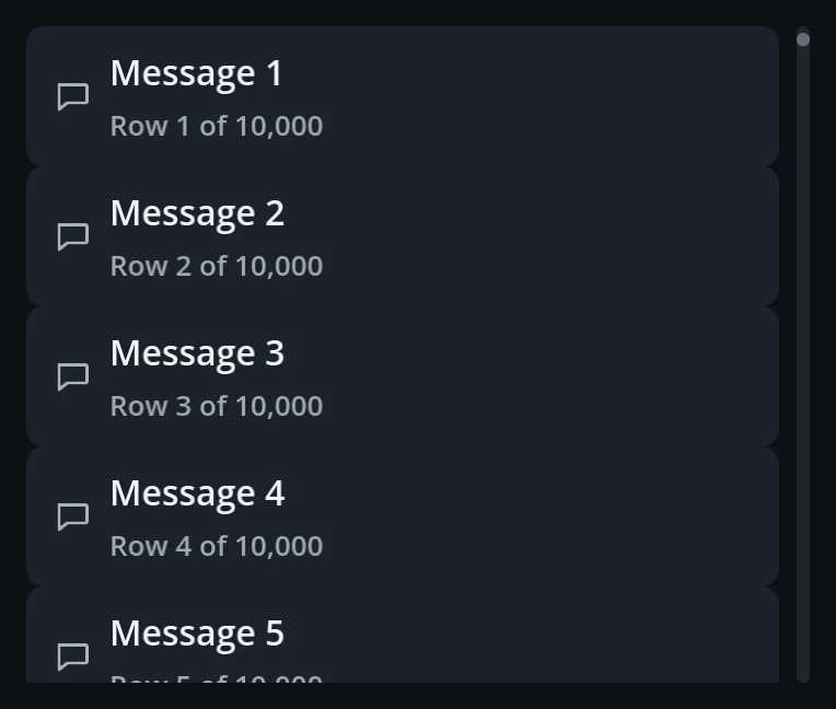
Thousands of rows; only the ones in view are built.
extends GoScroll
var feed := GoListView.make(10000, 72.0, func(index: int) -> Control: return post_row(posts[index]))
feed.end_reached.connect(load_more)
GoReorderList
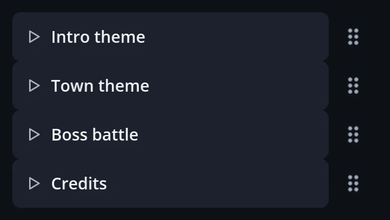
Rows you drag into order by a grip or a long press.
extends Container
var queue := GoReorderList.make([intro_row, theme_row, boss_row])
queue.reordered.connect(func(from: int, to: int) -> void: songs.insert(to, songs.pop_at(from)))
GoSwipeRow
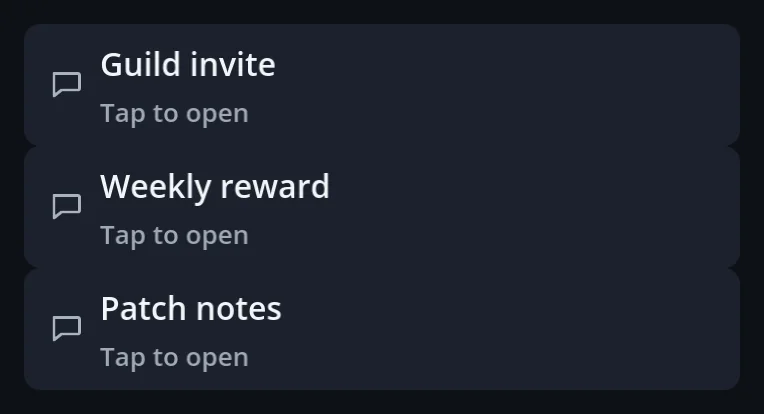
A row you swipe aside to delete or archive; the list still scrolls.
extends Container
inbox.add_child(GoSwipeRow.wrap(mail_row, {"icon": GoIconSet.TRASH, "text": "Delete",
	"tone": GoTheme.DANGER, "action": delete_mail}))
GoTable
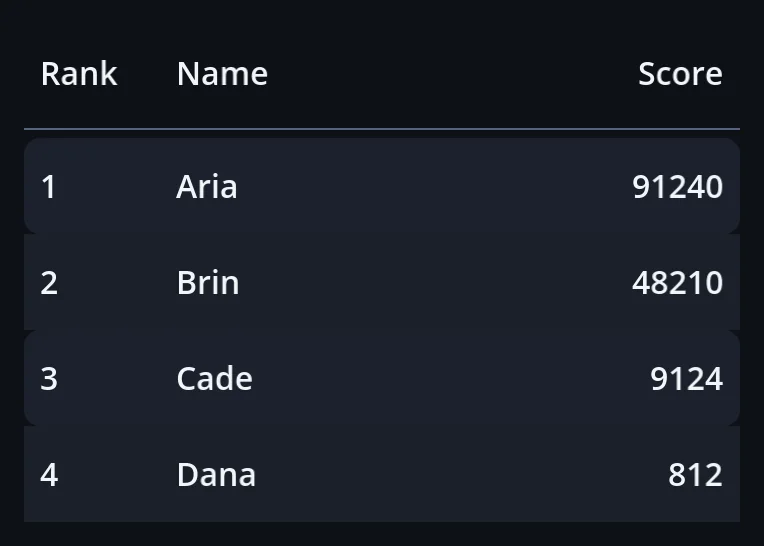
Sortable headers and selectable rows; numbers sort as numbers.
extends VBoxContainer
var board := GoTable.make(["Name", {"text": "Score", "numeric": true}], [["Ann", 9124], ["Ben", 91240]])
board.row_selected.connect(open_profile)
GoStyle.card · item_card
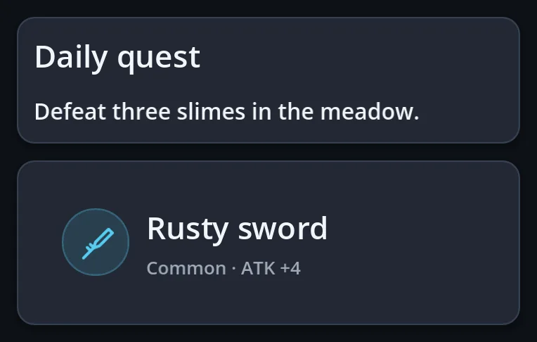
A card, and the detail card of a picked item.
a function of GoStyle
var card := GoStyle.card()
card.add_child(GoStyle.label("Daily quest"))
popup.add_child(GoStyle.item_card({"title": "Rusty sword", "subtitle": "Common"}))
GoStyle.avatar

Initials or a picture in a disc.
a function of GoStyle
row.add_child(GoStyle.avatar("AK", 40)) GoStyle.label
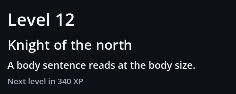
Text in one of seven type roles, from micro to title.
a function of GoStyle
page.add_child(GoStyle.label("Level 12", GoTheme.ROLE_TITLE))
page.add_child(GoStyle.label("Next level in 340 XP", GoTheme.ROLE_CAPTION, GoUi.color(GoTheme.MUTED)))
HUD and game shapes (30)
GoBar
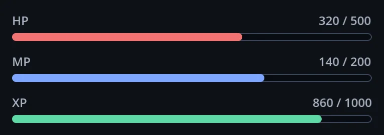
HP, MP and XP bars with a value, a fraction or a percent.
extends Control
var hp := GoBar.new()
hp.label_text = "HP"
hp.set_values(320, 500)
GoSlot

A quick slot: icon, quantity, cooldown and shortcut on one face.
extends Button
var potion := GoSlot.new()
potion.icon_name = GoIconSet.POTION
potion.quantity = 12
potion.start_cooldown(5.0)
GoSlotGrid
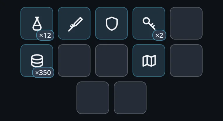
An inventory grid; items can be dragged between cells.
extends HFlowContainer
var bag := GoSlotGrid.new()
bag.set_cell(0, {"icon": GoIconSet.POTION, "quantity": 12})
GoJoystick
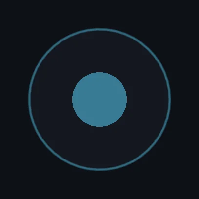
A virtual stick — fixed, following the thumb, or relative.
extends Control
var pad := GoJoystick.new()
pad.mode = GoJoystick.Mode.FOLLOW
pad.moved.connect(func(direction: Vector2) -> void: player.move(direction))
GoKbd
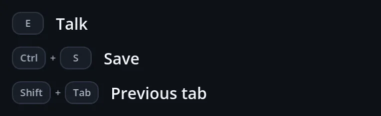
Key caps that read the real binding, so rebinding never makes the hint lie.
extends HBoxContainer
hint.add_child(GoKbd.for_action(&"interact")) GoChoiceColumn
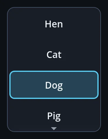
A short column of choices tapped once — a summon list; the game marks any number of rows.
extends Control
var animals := GoChoiceColumn.make(["Hen", "Cat", "Dog", "Pig", "Cow"], 4, summon)
animals.set_selected(2, true)
side_bar.add_center(animals)
GoLevelCard
A stage-select tile: thumbnail, title, subtitle, and a check, a padlock or a PLAY! tag by state.
extends Button
var card := GoLevelCard.make("STAGE 3", "OPPONENTS: 3", GoLevelCard.State.CURRENT)
card.pressed.connect(play_stage)
GoStarRow
A row of rating stars: some lit in gold, the rest dim — a level's best clear or a result screen's grade.
extends HBoxContainer
var rating := GoStarRow.make(2)
rating.star_size = 40.0
GoKeyCluster
Four movement keys in an inverted T — WASD or the arrow keys — as a controls page shows them.
extends Control
var wasd := GoKeyCluster.make(["W", "A", "S", "D"])
var arrows := GoKeyCluster.make(GoKeyCluster.ARROWS)
GoCoverImage
A picture that fills its box, cropping the overflow like CSS object-fit: cover.
extends Control
var shot := GoCoverImage.make(preload("res://art/level_3.png"), Vector2(0.5, 0.3))
shot.custom_minimum_size = Vector2(74, 74)
GoHudCard
One board of a match HUD's top row: an icon with a banner and bars, a count, a clock or a ready gauge.
extends PanelContainer
var clock := GoHudCard.make(GoUi.skin().widget_art(&"stopwatch"))
clock.title = "MATCH TIME"
clock.set_clock(83.0)
GoCountdown
The match-start count: 3, 2, 1, GO! big on a disc, each step popping in.
extends Label
var count := GoCountdown.new()
count.show_step("3")
GoHudButton
A HUD corner button: a picture button with its keyboard key on a cap beside it.
extends HBoxContainer
var pause := GoHudButton.make(GoUi.skin().widget_art(&"pause_button"), 52.0, "Esc")
pause.pressed.connect(func() -> void: print("pause"))
GoNameplate
A name plate floating over a character in a 3D world, the same size at any distance.
extends PanelContainer
var plate := GoNameplate.make("BOT RED", Color(0.86, 0.24, 0.24))
plate.follow(camera, anchor.global_position)
GoNoticeFeed
A feed of one-line notices, such as a kill feed, that stack, fade in and leave on their own.
extends VBoxContainer
var feed := GoNoticeFeed.new()
feed.push("RED knocked out BLUE")
feed.push("YOU knocked out GREEN", true)
GoTouchButton
A round thumb button for touch screens, with a cooldown ring, a ready pulse and optional drag-to-aim.
extends Control
var jump := GoTouchButton.make(&"btn_jump", "JUMP", 86.0)
jump.pressed_down.connect(send_jump)
var skill := GoTouchButton.make(&"btn_repulse", "REPULSE", 92.0)
skill.cooling = true
skill.cooldown = 0.4
GoSpotlight
Dims the screen round one control and rings it; the dim fades, the ring stays.
extends Control
var spot := GoSpotlight.new()
hud.add_child(spot)
spot.follow(jump_button, true)
GoEditFrame
The outline a layout editor draws round each thing the player can move: idle, selected with handles, warning, ghost. Never takes input.
extends Control
var frame := GoEditFrame.new()
editor.add_child(frame)
frame.circle = true
frame.state = GoEditFrame.State.SELECTED
GoGestureHint
Ghost fingertips that play a touch gesture in a loop — two of them spread apart and pinch back together to teach pinch-to-zoom. Never takes input.
extends Control
var hint := GoGestureHint.new()
hud.add_child(hint)
hint.position = Vector2(480, 0)
hint.size = Vector2(480, 540)
hint.play()
GoTaskCard
A tutorial lesson's card: step, title, what to do, part chips that tick off and a hint; folds to one row.
extends PanelContainer
var card := GoTaskCard.new()
card.caption = "TRAINING · STEP 1/12"
card.title = "MOVE"
card.body = "Move with W A S D."
card.set_parts(["W", "A", "S", "D"], [true])
GoPerfReadout
An always-on performance band: fps, frame time, triangles, draw calls, nodes and memory; turns red as fps drops.
extends PanelContainer
var perf := GoPerfReadout.new()
perf.tier_text = "LOW (auto)"
overlay_layer.add_child(perf)
GoSignalBars
A phone-style signal meter: bars rising left to right, lit green, gold or red, with a readout such as "48 ms" — a match HUD's ping.
extends PanelContainer
var ping := GoSignalBars.make(4, GoSignalBars.Tone.GOOD)
ping.set_reading(2, GoSignalBars.Tone.FAIR, "180 ms")
GoRewardRow
A row for what a player earns by progress: a quest or achievement with a bar, its payment and a claim pill, a check or a padlock by state. Fixed height for GoListView.
extends PanelContainer
var quest := GoRewardRow.make("Win 3 matches", GoIconSet.STAR)
quest.key = "win_3"
quest.set_progress(1, 3)
quest.set_reward(50, GoIconSet.COIN)
quest.set_claim_text("CLAIM")
quest.set_state(GoRewardRow.State.READY)
quest.claim_pressed.connect(func(id: Variant) -> void: server.claim(id))
GoFoldTab
Folds a HUD panel into a small pill and back: a slim handle with a chevron, then a pill that keeps a glyph, a short text and a gauge. The host lays the HUD out again on fold_changed.
extends Button
var tab := GoFoldTab.new()
tab.side = SIDE_LEFT
tab.icon_name = GoIconSet.USERS
tab.pill_text = "3"
tab.fold_changed.connect(func(now_folded: bool) -> void: party.visible = not now_folded)
GoMapPreview
A small map of a level: areas, links and start dots; a grey silhouette when locked.
extends Control
var map := GoMapPreview.new()
map.add_rect(Vector2(0, 0), Vector2(6, 4), Color("#f2b84b"))
map.add_circle(Vector2(18, 0), 5.0, Color("#6fc3ff"))
map.add_link(Vector2(0, 0), Vector2(18, 0), 2.0, Color("#c9a26b"))
map.set_starts(PackedVector2Array([Vector2(-3, 0), Vector2(20, 0)]))
GoRewardCalendar
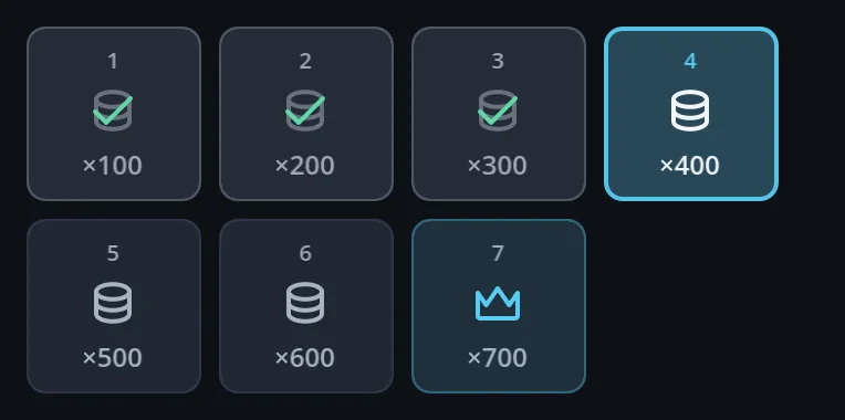
Daily attendance rewards; only today can be pressed.
extends VBoxContainer
var attendance := GoRewardCalendar.make(days, claimed_until)
attendance.claimed.connect(func(day: int) -> void: server.claim_day(day))
GoRadar
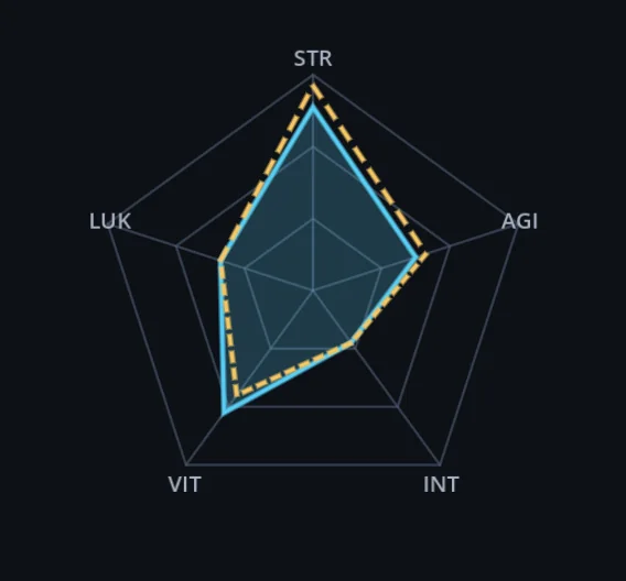
The stat pentagon, with a dashed line to compare gear.
extends Control
var stats := GoRadar.make({"STR": 0.85, "AGI": 0.5, "INT": 0.3, "VIT": 0.7, "LUK": 0.45})
stats.set_compare(with_new_sword)
GoDonut
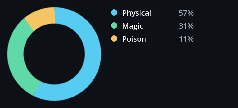
Shares as slices, with a legend in words as well as colour.
extends Control
var share := GoDonut.make([{"label": "Physical", "value": 620}, {"label": "Magic", "value": 340}])
card.add_child(share.legend())
GoZoomView
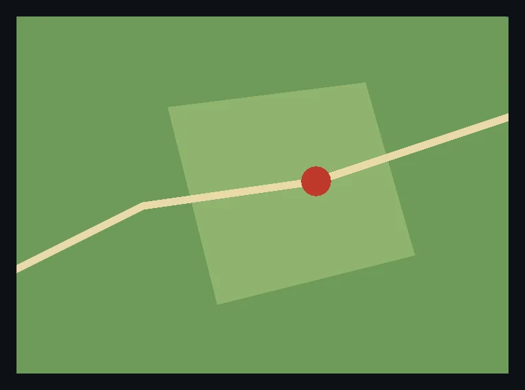
Pinch, wheel and double tap to zoom a map; pans inside its edges.
extends Control
var map := GoZoomView.wrap(world_map, 4.0)
map.custom_minimum_size.y = 320
page.add_child(map)
GoStyle.hud_panel · overlay_panel
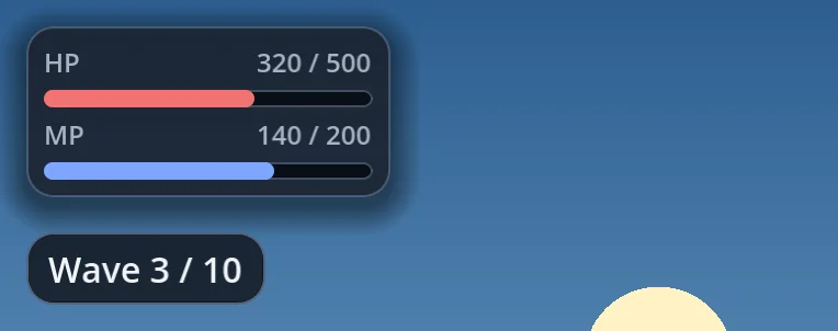
Panels that float over the game, so text stays readable on any picture.
a function of GoStyle
var bars := GoStyle.hud_panel()
var pill := GoStyle.overlay_panel()
Looks and system (9)
GoUi · GoThemePresets
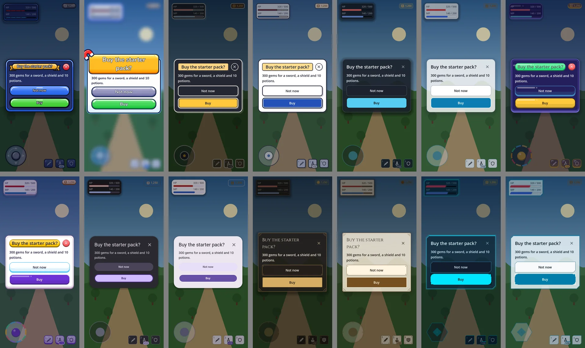
Pick a preset — default, sci-fi, medieval, Material, kids, comic or arcade; read colours and sizes from the tokens.
extends RefCounted
GoUi.use_preset(GoThemePresets.MATERIAL_LIGHT)
var accent := GoUi.color(GoTheme.ACCENT)
var gap := GoUi.metric(GoTheme.GAP)
GoConfig
One resource for every setting, which survives add-on updates.
extends Resource
GoUi.config.reduce_motion = true
GoUi.config.container_alpha = 1.0
GoUi.refresh()
GoSkin
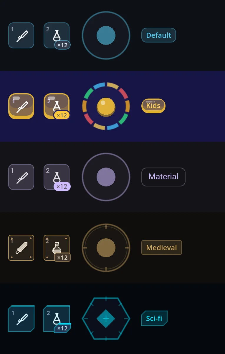
The shapes code draws — chips, slots, the joystick, the new parts — in your own style.
extends Resource
class_name MySkin
extends GoSkin

func banner_box() -> StyleBox:
	return surface_box(GoTheme.BOX_CARD)
GoIconSet · GoGameIcons
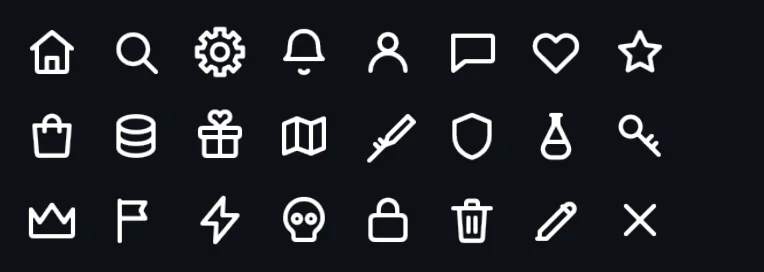
Icons by name: the default set, 187 game icons, or your own SVGs.
extends Resource · RefCounted
GoUi.config.icons = GoGameIcons.icon_set()
var gear := GoUi.icons().node(GoIconSet.SETTINGS, 24)
GoStyleBoxCut · GoStyleBoxBracket · GoStyleBoxMedieval
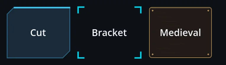
Chamfered, bracketed and forged faces for your own panels.
extends StyleBox
var face := GoStyleBoxCut.new()
face.cut = 8
panel.add_theme_stylebox_override(&"panel", face)
GoStyleBoxSprite · GoTextureSprite
A painted PNG drawn in nine slices, and its icon twin for a slider handle or a switch.
extends StyleBox
var plate := GoStyleBoxSprite.new()
plate.texture = preload("res://ui/painted/gloss_green.png")
plate.pixels_per_unit = 3.0
button.add_theme_stylebox_override(&"normal", plate)
GoSafeArea · GoScale
Notches, the gesture bar and the keyboard; breakpoints in dp.
extends Control · RefCounted
var usable := GoSafeArea.usable_rect(get_viewport())
var size_class := GoScale.breakpoint_for_dp(minf(usable.size.x, usable.size.y))   # by the short side
GoFeedback
Sound cues and haptics routed to your own audio; gohud ships no sound.
extends RefCounted
GoFeedback.sound_handler = func(cue: String) -> void: audio.play_cue(cue)
GoFeedback.haptic_handler = func(ms: int, amplitude: float) -> void: Input.vibrate_handheld(ms, amplitude)
GoBackPolicy
Who owns Android Back and Escape right now, shared across windows.
extends RefCounted
GoBackPolicy.acquire(get_tree())