The small things decide whether it looks good
Polish the big panels all you like — what catches the eye is always something small: a word split in two, a glow chopped off, a cramped slot. Four such things were pointed out on 2026-09-13 and fixed in the widgets and themes, not in the demo screen, so every screen gets the same result.
| What showed | Cause | Fix |
|---|---|---|
The coach mark's Done became Don/e |
A button with wrapping on subtracts its text width from its minimum — squeeze it and it breaks inside a word | GoStyle.fit_words(): one word never wraps; several words wrap, but the longest word always fits — judged on the displayed text, not the translation key, and re-applied by the form when the language changes |
| A full-width button's glow cut off vertically on the left | A scroll container clips at its edge, no exceptions. Only the right survived, thanks to the rail gutter | GoScroll borrows the parent's padding to push its edge 12dp out and gives it back inside — content stays put |
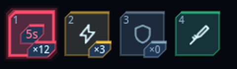
| Time, icon and count stacked vertically in a slot | Three rows inside 48dp | Icon large in the centre, shortcut top-left, count as a bottom-right badge, remaining time as a badge over the icon — badge panels come from the skin's badge_box() |
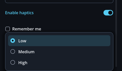
| A flat dropdown with no visible selection | Item hover used the button panel; radio marks were the engine's faint default | A dedicated hover panel (soft accent tint), the same radio artwork as checkboxes, item height sized for touch |
Give icon-only buttons a description with GoStyle.icon_button(icon, action, -1, tooltip_key) —
the tooltip for mouse users and the accessibility name for screen readers both come from that one value.
gohud draws the tooltip itself: the engine's default splits the text one character per line when
its width calculation goes wrong (measured at 1dp wide).
The coach-mark card keeps off fixtures
In landscape the card used to be sent to the very top or bottom edge — exactly where headers and HUD
pieces live; in the demo it sat on the header's → ×. It now stays level with its target,
steps around any GoHudAnchor that reserves space, and takes other things to avoid via
keep_clear. It moves the shortest distance that clears the obstacle without covering the
target, and stays put when the screen is too small to clear everything — overlapping beats vanishing.
Its depth — so it reads as above the page — comes from skin dials
(float_shadow_size, float_shadow_lift, float_shadow_alpha; chamfered skins use float_glow_size).
tour.keep_clear = [header_bar, toolbar] # fixtures that are not anchorsScreens with a mouse and a keyboard
A finger has no hover state. Build against mobile only and two desktop-only states go unchecked —
and one of them was broken: gohud's focus ring was invisible on a primary button. The panel is
the accent colour and so was the ring: 1.00:1, the same colour drawn over itself. Moving
by keyboard, there was no way to tell where you were.
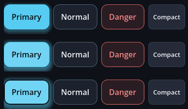
Filled buttons (GoPrimaryButton, GoDangerSolidButton) use a ring that
contrasts with their own panel — dark on a dark theme, white on a light one, a dark targeting
bracket in sci-fi. The contrast checker measures the focus ring against the panel it sits on, so
the rule survives a palette change (WCAG 2.4.11 asks for 3:1 on focus indicators).
The HUD widgets
GoHudAnchor — nine spots
Respects the safe area and edge margins. Give it a landscape_spot and it moves in
landscape — controls that sit bottom-centre in portrait can go bottom-right instead.
Keeping content out from under the HUD
When a scrolling screen shares the display with a HUD, the content slides underneath it and the two sets of text overlap until neither can be read. It happened twice in this add-on: an input's placeholder squeezed out between the quick slots, and a settings toggle's knob landed on the health bar.
form.avoid_hud = true                  # keep clear of every visible GoHudAnchor
joystick_anchor.reserve_space = false  # …except ones that only appear under a finger
Each rectangle is avoided in whichever direction costs the least area. A bar in the top-right is stepped around downwards on a portrait phone (13% of the height) and sideways in landscape (21% of the width) — avoiding it vertically in landscape would cost 27% of the screen. Ground already given up is subtracted before the next rectangle is measured.
HUD pieces collide with each other too
The nine spots divide the screen; they do not guarantee the pieces miss each other. A wide snackbar at top-centre landed squarely on the health bar at top-right, hiding the value — you could not read how much health was left.
notice_anchor.avoid_peers = true      # settles below the fixed HUD
notice_anchor.reserve_space = false   # and does not push the page while it is up
It steps aside vertically only — moving sideways as well would make a centred toast appear in a different place each time it shows. And it only avoids pieces that are not stepping aside themselves: if both yield, the two swap places forever.
GoBar — health, mana, experience
var hp := GoBar.new()
hp.label_text = "HP"
hp.ink = GoUi.color(GoTheme.DANGER_FILL)   # the fill-only token
hp.set_values(320, 500)                     # "320 / 500"
Changes ease over 0.18s — a health bar that jumps does not tell you how hard you were hit.
reduce_motion makes it instant. Large numbers abbreviate to 12.3k so the
bar's width does not jitter as digits come and go.
GoSlot — one quick slot
Icon, quantity, cooldown and shortcut on a single face. Hanging badges off a small circle makes each slot a different width and the row wobbles.
touch_peers.
keyboard_focus is off by default, so a row of eight slots does not sit between a keyboard user and
every settings control in the Tab order. Turn it on when a keyboard or gamepad is the only input.
GoJoystick — virtual stick
| Mode | Behaviour |
|---|---|
FIXED | Always the same place — easy to find without looking |
FOLLOW | Appears where the thumb lands |
RELATIVE | Keeps following the thumb after appearing — comfortable for long movement |
The Vector2 from moved has length 0–1, so you can multiply it straight into
a speed; it does not vary with screen size or DPI.
GoIconButton — looks small, presses large
touch_peers.