Pick the right popup
A popup interrupts. Before choosing one, answer a single question: must the player answer before the game goes on? If yes, block. If no, never block — a card that stops the game for news the player did not ask for is the fastest way to make them close your game.
- A question with an answer — buy, delete, leave, overwrite →
GoDialogs.confirm(). Something to acknowledge →alert(). One of a few options →choose(). - A screen of its own — settings, a character sheet, a shop item →
GoSurfacein the middle of the screen. - A long list or a management page — the bag, mail, friends →
GoSheetfrom the bottom on a phone,GoDrawerfrom the side on a wide screen. - Something about the thing just pressed — an item's stats, its actions →
GoPopoverorGoContextMenubeside it. - News the game can carry on through — saved, dropped, invited →
GoSnackbar,GoNoticeorGoPromptCard. These never take the screen. - Teaching the controls →
GoCoachMark. Cheats while you build →GoConsole.
Every popup at a glance
| Popup | Stops the game | Back / Escape | A tap outside | Use it for |
|---|---|---|---|---|
GoDialogs confirm · alert | Yes | Closes it — confirm answers false, alert returns | Closes it only with dismiss_on_scrim | Questions that need an answer |
GoDialogs.choose | Yes | Closes it — answers -1 | Closes it only with dismiss_on_scrim | Picking one of a few |
GoSurface | Yes | Asks to close the topmost | Asks to close with dismiss_on_scrim | Windows of your own |
GoSheet | Yes | Closes the whole sheet | Closes it | The bag, a shop list, mail |
GoDrawer | Yes | Android Back only | Closes it | A side list on a wide screen |
GoPopover | Until it closes | Closes it | Closes it — and goes no further | Item and skill details |
GoCombobox list | Until it closes | Closes it | Closes it | A pick list that searches |
GoContextMenu · dropdown · select | The engine's menu | The engine's menu | Closes it | Actions, short lists |
GoSnackbar | No | — | Reaches the game | Saved · Undo · Retry |
GoPromptCard | No | — | Reaches the game | An invite, a trade request |
GoNotice | Never | — | Reaches the game | A fixed line on the HUD |
GoBanner | No — it is in the page | — | — | "You're offline. Retry" |
GoCoachMark | Its card only | Ends the tour | Reaches the game | A first-run tour |
GoConsole | Its panel only | The Escape key closes it | Reaches the game | Debug commands |
Which layer each one opens on, and why in that order, is under Layers, Back and input.
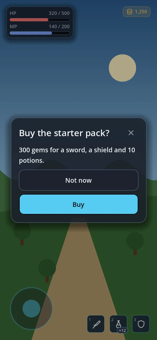
GoDialogs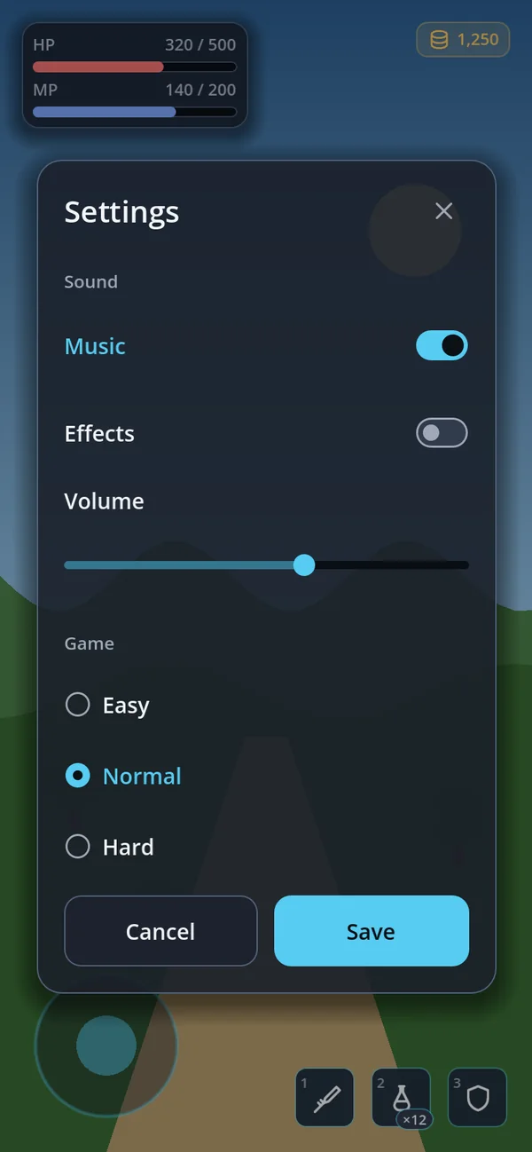
GoSurface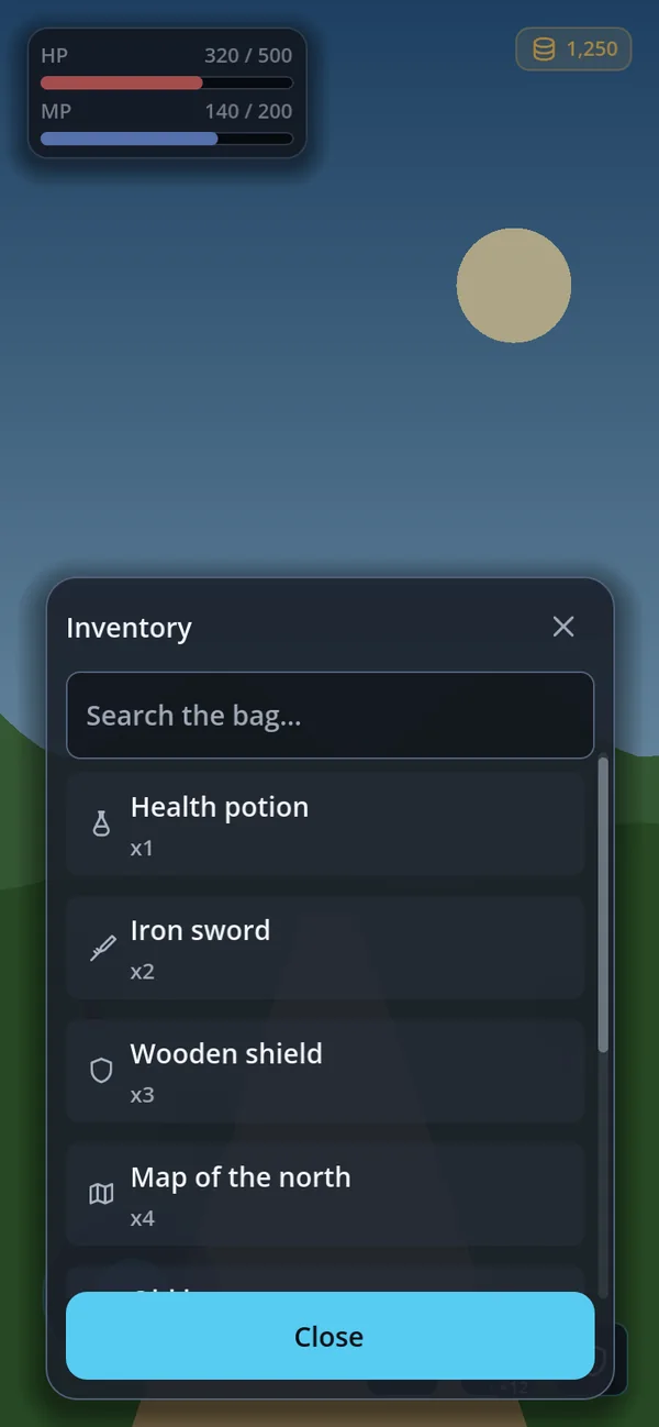
GoSheet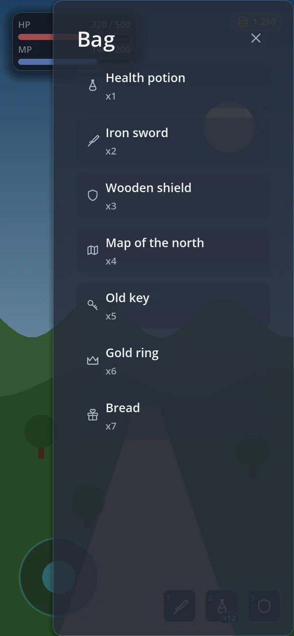
GoDrawer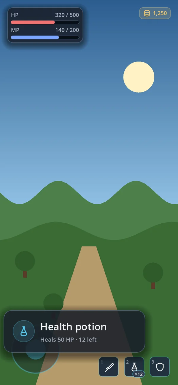
GoPopover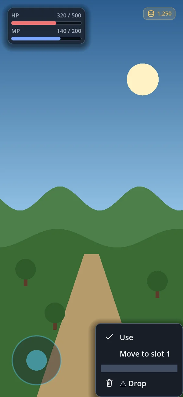
GoContextMenu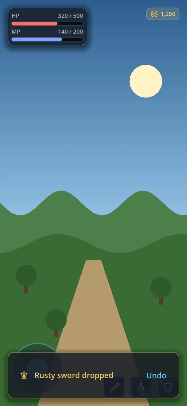
GoSnackbar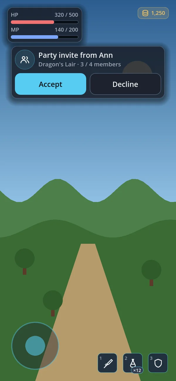
GoPromptCard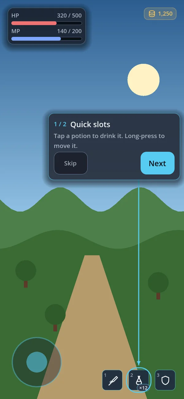
GoCoachMark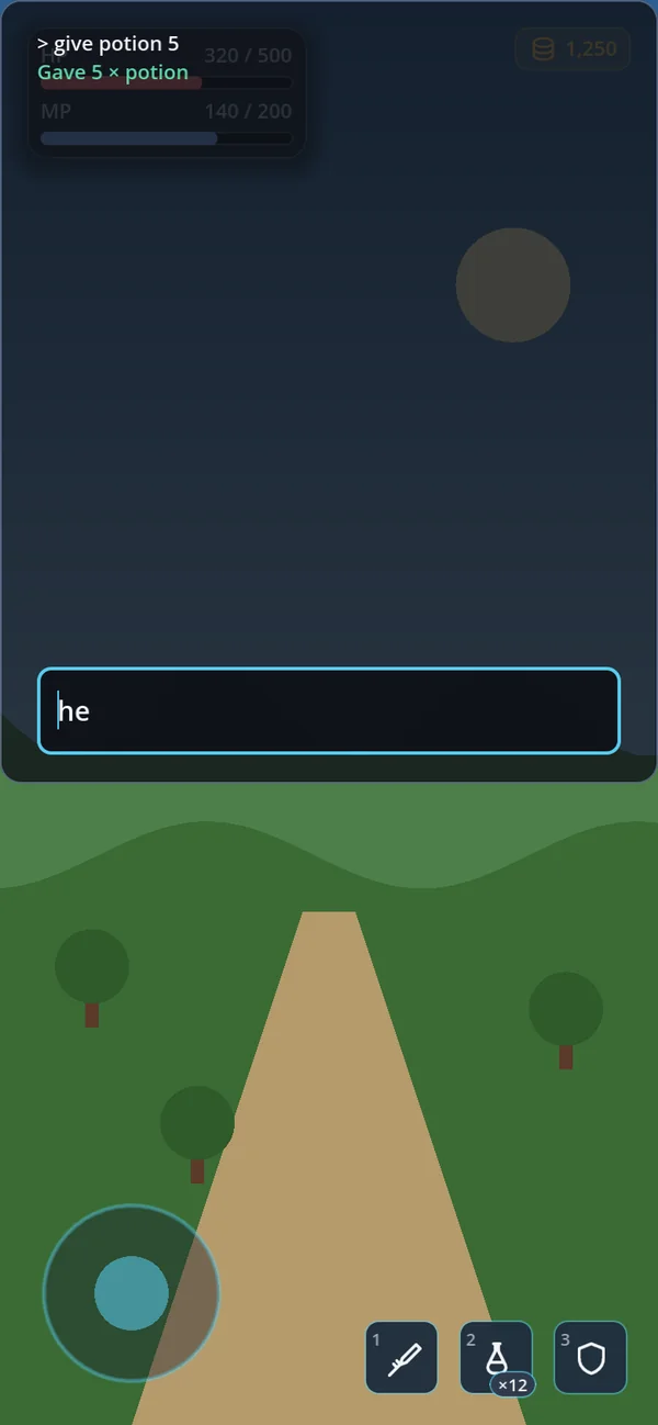
GoConsoleEvery picture on this page is the same little game — health and mana top left, coins top right, a joystick and three
quick slots at the bottom — in default_dark, with one popup open over it. The same
popup in all fourteen looks →
Anatomy of a popup
Almost every blocking popup in gohud — dialogs, sheets, popovers, the combobox list and your own
windows — is one node, GoSurface. Learn its parts once and you know all of them.
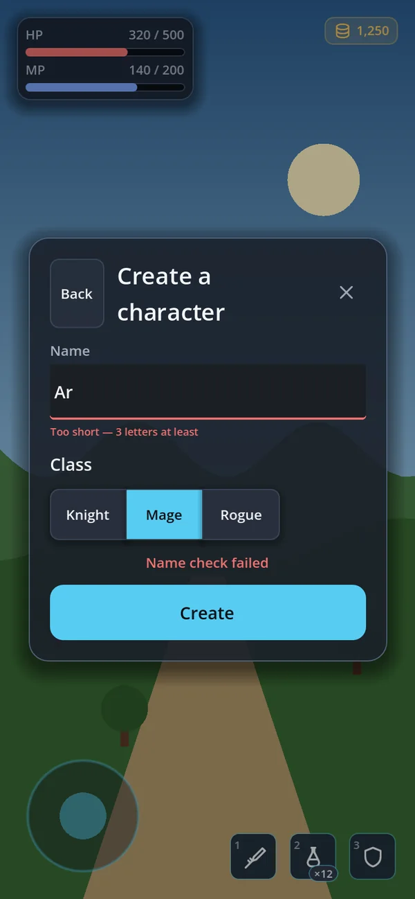
| Part | What it is | How you reach it |
|---|---|---|
| Layer | The CanvasLayer the popup lives on. Its number decides what it covers. | Yours for a GoSurface; built in for the others (table) |
| Scrim | The veil over everything behind. It catches the taps that miss the card. | scrim_transparent, dismiss_on_scrim, the theme's scrim colour |
| Card | The window itself — the theme's panel face, rounded, cut, forged or jelly depending on the look. | card, alpha |
| Header | An optional back button, the title (two lines at most, then "…"), the close button. | set_title() · set_title_key() · set_back() · close_enabled · show_header |
| Toolbar | A pinned row under the header — a search field, filter chips. Hidden until you use it. | toolbar |
| Body | The scrolling part. Put the content here. | body · scroll_body · clear() |
| Status line | A pinned line between the body and the footer — "Name check failed", "Saving…". | set_status_text() · set_status_key() · clear_status() |
| Footer | Pinned buttons at the bottom. Hidden until you use it. | footer |
toolbar, the status line and footer; they stay put while the body scrolls.
Dialogs you await
GoDialogs asks and waits. One node, three questions — and the answer comes back on the same
line, so the code reads in the order the player experiences it.
var dialogs := GoDialogs.new()
add_child(dialogs)

if await dialogs.confirm("Buy the starter pack?", "300 gems for a sword, a shield and 10 potions.",
        "Buy", "Not now"):
    buy_starter_pack()
confirm()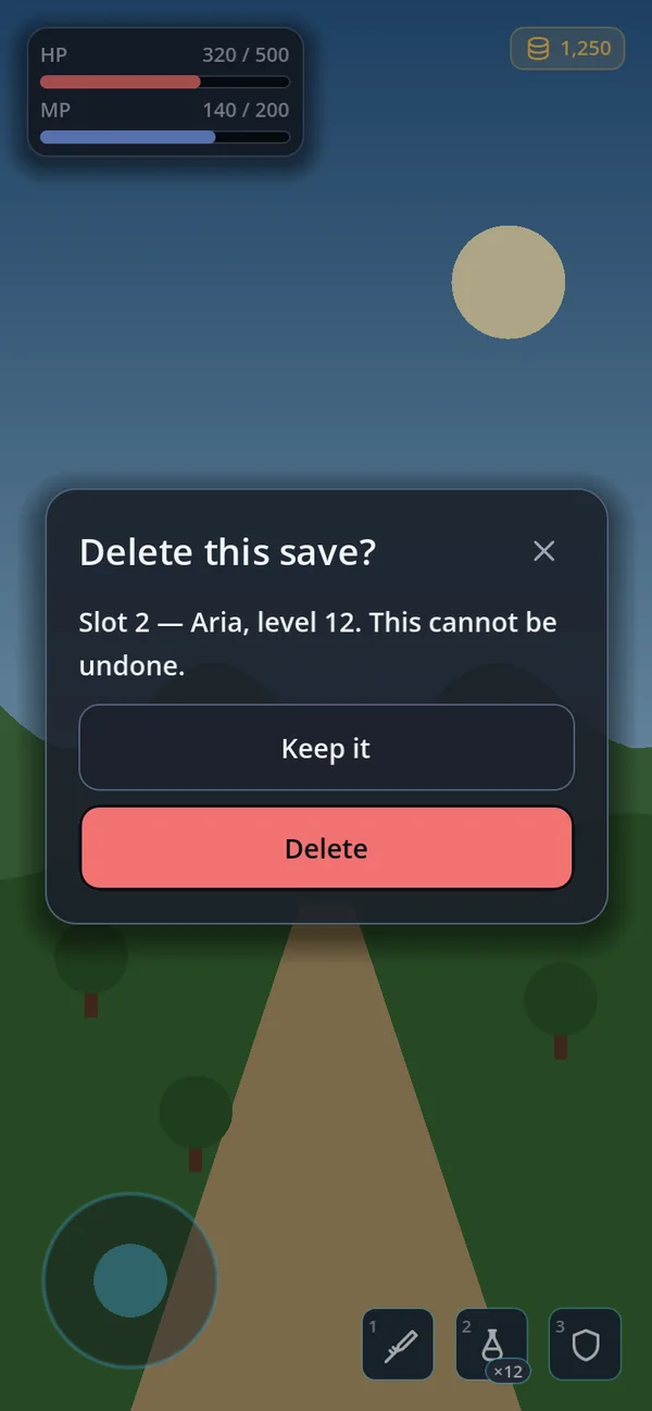
confirm(…, true) — destructive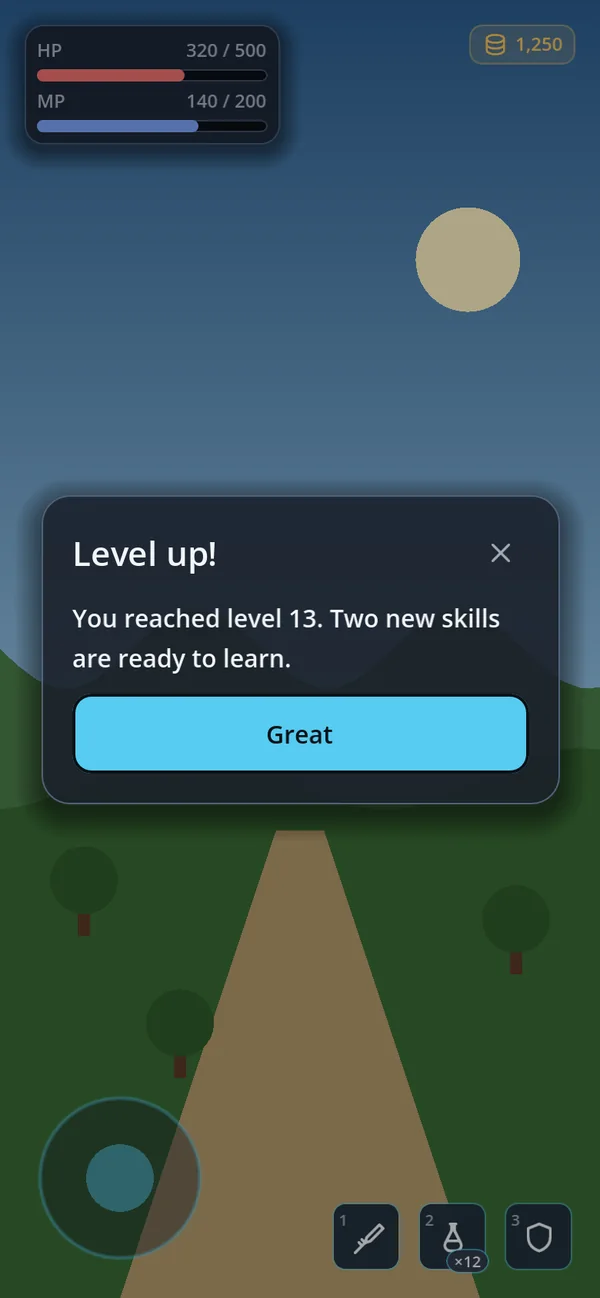
alert()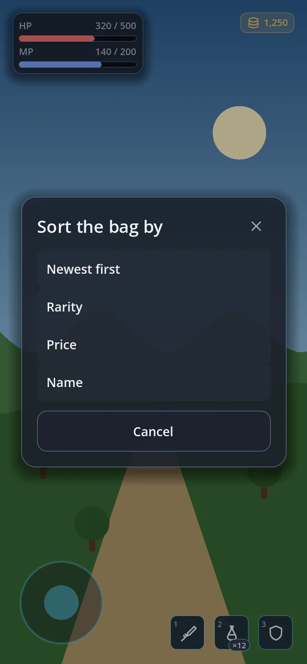
choose()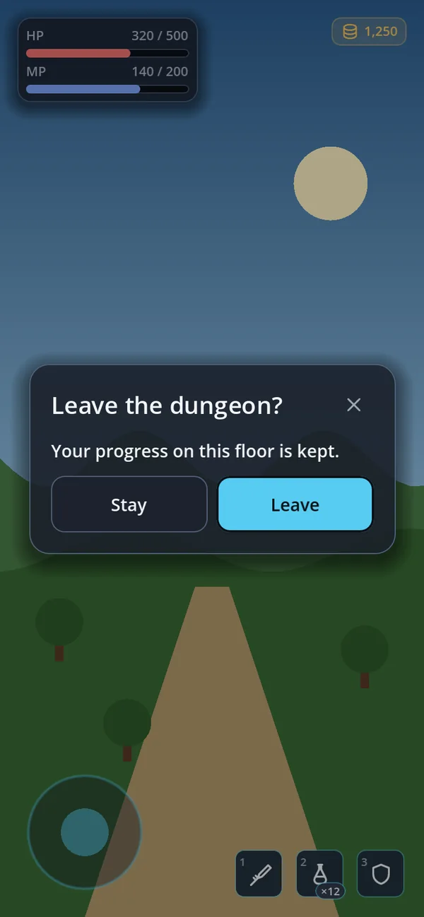
ActionLayout.HORIZONTALThe three questions
confirm(title, body, ok_text := "", cancel_text := "", extra := "",
        args := {}, destructive := false) -> bool
alert(title, body, ok_text := "", extra := "", args := {})      # await it to wait
choose(title, options: Array, cancel_text := "", translate := false) -> int
confirm_key(…) · alert_key(…) # translation keys| Call | Returns | Use it for |
|---|---|---|
confirm() | true or false | Yes or no — buy, delete, leave, overwrite. |
alert() | nothing — await it to wait | Something the player must see: a reward, a lost connection. |
choose() | the option's index, or -1 | One of a few. An option is a String or {text, icon, danger, subtitle}. |
confirm_key() · alert_key() | as above | The same with translation keys — the words follow a language change while the dialog is open. |
Empty button labels fall back to the kit's own words (confirm, cancel in GoConfig.text_keys).
extra is added to the body on a new line. args fills {placeholders} in the title
and the body: confirm("Buy {item}?", "It costs {price} gold.", "Buy", "", "", {"item": name, "price": 300}).
Every way out has an answer
| The player… | confirm | alert | choose |
|---|---|---|---|
| presses OK / an option | true | returns | the option's index |
| presses Cancel | false | — | -1 |
| presses ×, Escape or Android Back | false | returns | -1 |
taps the scrim (only with dismiss_on_scrim) | false | returns | -1 |
the GoDialogs node leaves the tree | false | returns | -1 |
So code after await always runs — no answer is ever left hanging, even when the scene changes under the dialog.
Destructive actions
Pass destructive = true for something that cannot be undone. The OK button becomes the filled
Tone.DANGER_SOLID button — white on red in every look, where a tinted danger label would have to darken to
near-black on a light theme to stay legible. The tone is reset on every call, because the window is reused.
if await dialogs.confirm("Delete this save?", "Slot 2 — Aria, level 12. This cannot be undone.",
        "Delete", "Keep it", "", {}, true):
delete_save(2)Button layout
action_layout | What it does |
|---|---|
VERTICAL (default) | Buttons stacked, full width. Safe for every language — a long German or Russian label never squeezes. |
HORIZONTAL | One row, half the width each. |
AUTO | One row only when both labels fit half the card on a single line; stacked otherwise. Decided again on a language change or a resize. |
action_gap is the space between the buttons, body_gap the space above them — make it wider than
the button gap so the question and the choice read as two parts. For one dialog only, call
set_next_action_layout() before opening it. An alert's single button always takes the full width.
One at a time
A second confirm() while one is open returns false at once — a dialog never stacks on a dialog by
accident. Turn on queue_when_busy and it waits its turn instead; alert() always waits.
queue_limit (8) caps the line, and on overflow the oldest request is answered false.
pending() counts the waiting requests and clear_pending() answers them all false.
choose() never queues: it returns -1 when a dialog is already open.
Phone and desktop
choose() opens as a sheet from the bottom on Android and iOS — where the thumb is — and as a card in the
middle on a desktop. A confirm is capped at max_width (420dp) and centred. Set layer_index,
max_width and the other exports before add_child; they are applied when the node enters the tree.
var picked := await dialogs.choose("Sort the bag by", [
    {"text": "Newest first", "icon": GoIconSet.CLOCK},
    {"text": "Rarity", "icon": GoIconSet.STAR},
    {"text": "Drop everything", "icon": GoIconSet.TRASH, "danger": true}])
if picked >= 0:
    sort_bag(picked)
GoSurface — a window of your own
When a popup is more than a question — settings, a character sheet, an item to buy — build it on
GoSurface. The safe area, the keyboard, pinned rows, scrolling, Back, focus and resizing are done.
var layer := CanvasLayer.new()
layer.layer = 50
add_child(layer)

var window := GoSurface.new()
window.set_title("Settings")
window.close_requested.connect(layer.queue_free)
window.body.add_child(GoStyle.toggle("Music", false))
window.body.add_child(GoStyle.slider(0.0, 1.0, 0.05))
var row := GoStyle.row()
row.add_child(GoStyle.button("Cancel", window.request_close))
row.add_child(GoStyle.button("Save", save_and_close, GoStyle.Tone.PRIMARY))
window.footer.add_child(row)
window.footer.visible = true
layer.add_child(window)close_requested. Hiding or freeing
the window is the owning screen's job — only it knows whether "close" means save, discard or ask first.
Three placements
CENTER — confirmations, settings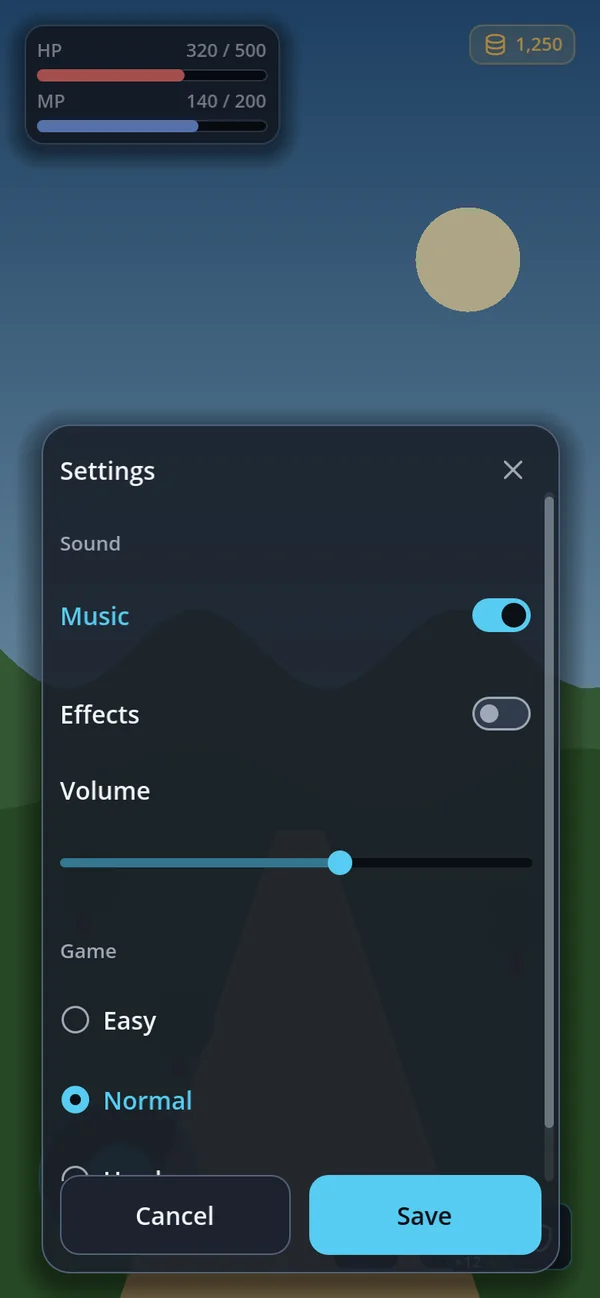
BOTTOM — lists, management pages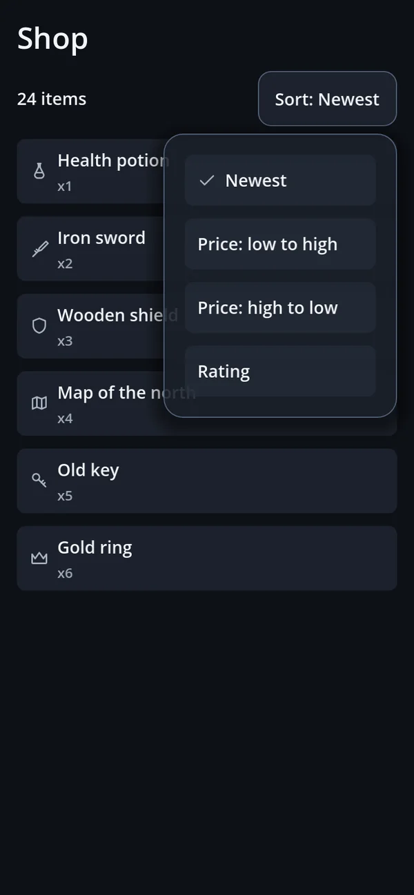
ANCHOR — beside a control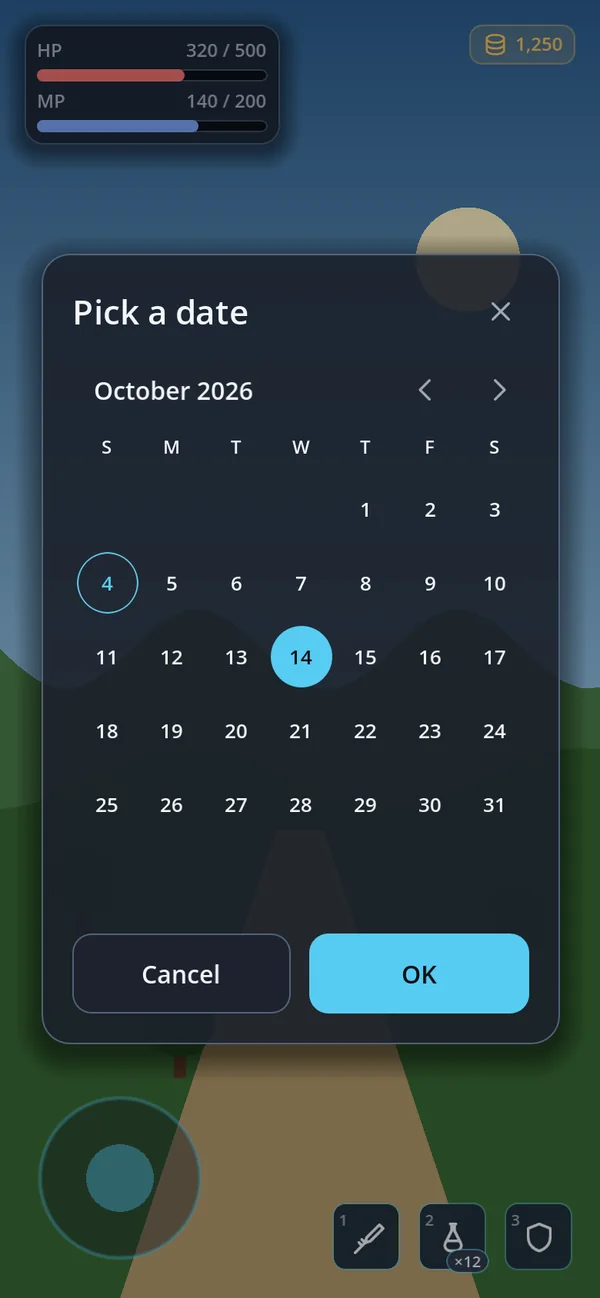
GoDatePicker in a CENTER windowANCHOR needs anchor_control. The card goes to the right of it if anchor_min_width fits,
otherwise to the wider side, otherwise inside the screen, and opens upward when there is more room above. It follows a
moving anchor every frame. anchor_width (320) and anchor_max_height (520) size it.
How big it gets
| Measure | Rule | Change it with |
|---|---|---|
| Room | The safe area, minus the keyboard, minus the screen margin (16dp, never more than 10% of the short side). | — |
| Width | 94% of the room in portrait, 72% in landscape, at most 480dp. | max_width · GoConfig.surface_width_ratio_* |
| Height | As tall as the content (fit_content), up to 68% of the room, capped at 72%. A centred card that is not resizable may grow to 94% to avoid scrolling. | height_ratio · max_height_ratio · max_height |
| Density | Dense when compact is set, the screen is under 420dp tall (a phone on its side), or the content does not fit: less padding, smaller gaps, a smaller title. It measures both and keeps the roomier one that fits — no jitter. | compact |
| Resize | With resizable, the title is a handle: drag it between 30% and the cap. height_changed(ratio) reports the result. | resizable |
A ratio above the cap is cut back, with one warning in a debug build. The keyboard pushes the card up and scrolls the focused field into view; the safe area keeps it off the notch and the gesture bar on Android and iOS.
Properties
| Property | Default | What it does |
|---|---|---|
placement | CENTER | CENTER, BOTTOM or ANCHOR |
dismiss_on_scrim | GoConfig.dismiss_on_scrim (false) | A tap on the scrim asks to close. A drag that started inside the card does not. |
scrim_transparent | false | Keep the game visible — the scrim still catches outside taps. |
close_enabled | true | Show × and let Escape and Back ask to close. |
show_header · scroll_body · resizable | true · true · false | The header row, the scrolling body, the drag handle. |
fit_content · compact | true · false | Size to the content; start dense. |
fade_in | GoConfig.surface_fade_in (false) | Fade the card in when it opens. Instant under reduce_motion. |
alpha | -1 (the theme's) | The card face's opacity, as a ratio. Only the face fades — never the text. |
initial_focus | none | The control focused on open. |
add_child: scrim_transparent, show_header, resizable and
scroll_body are applied when the window enters the tree. dismiss_on_scrim, close_enabled,
fade_in and initial_focus are read live.
Signals and calls
| Name | What it is |
|---|---|
close_requested | ×, Escape, Android Back or a scrim tap — and request_close(). Emitted only by the topmost window. |
back_requested · set_back(action) | The header's back button, for a window with pages. An empty Callable hides it. |
height_changed(ratio) | After a drag on the handle. |
is_top() · GoSurface.is_any_open() | Is this the window that takes Back — is any window open at all. |
relayout() | Lay out again now. Changing a sizing property already does it for you. |
Sheets and drawers
A list that needs room comes up from the bottom on a phone held upright — where the thumb is — and in from the side on a tablet or a desktop, where a sheet would cover the game.
GoSheet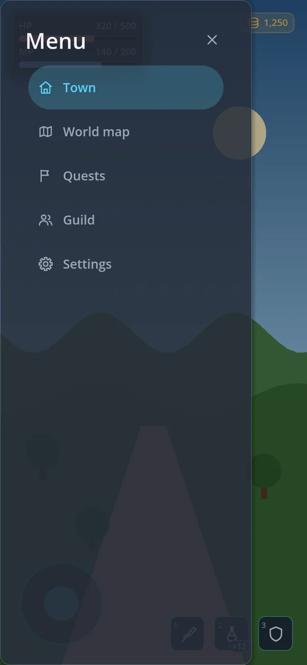
GoDrawer · LEFTGoDrawer · RIGHTGoSheet — pages from the bottom
var sheet := GoSheet.new()
add_child(sheet)

func show_bag(items: Array) -> void:
    sheet.open("Bag")
    var search := GoStyle.line_edit("Search the bag…")
    search.text_changed.connect(filter_bag)
    sheet.toolbar().add_child(search)
    sheet.toolbar().visible = true
    for item in items:
        sheet.body.add_child(GoStyle.list_button(GoIconSet.BOX, item.name, show_item.bind(item),
            Color.TRANSPARENT, item.description, false, GoIconSet.CHEVRON_RIGHT))
sheet.add_footer(GoStyle.button("Close", sheet.close, GoStyle.Tone.PRIMARY))- It is a
CanvasLayer(layer 10) holding aBOTTOM, resizableGoSurface— so it sits above the HUD, and the player can drag it taller. open(title)starts a fresh page: it clears the body, the toolbar and the back button and frees whatadd_footer()added. Call it again to show another page in the same sheet;set_back()shows a back button for the way home.open_key()takes a translation key.close()hides it — it is not freed, so the nextopen()is instant.closedandpage_changedtell you when.height_ratio(0.6) is the height it opens at;max_height_ratiolifts the cap;dismissable(true) closes it on a scrim tap.
set_back() — only the on-screen back button
walks back a page. If Back should step back, handle close_requested on sheet.surface yourself.
GoDrawer — from the side
var drawer := GoDrawer.new()
drawer.side = GoDrawer.Side.LEFT
drawer.follow_text_direction = true      # the start side: left, or right in Arabic
add_child(drawer)
drawer.body.add_child(GoNavBar.drawer_list([{"icon": GoIconSet.HOME, "text": "Town"},
    {"icon": GoIconSet.MAP, "text": "World map"}], 0, go_to))
drawer.open("Menu")- Layer 80. 42% of the screen wide (
width_ratio), betweenmin_width(320dp) andmax_width(420dp) — on a phone it covers most of the screen, which is why a sheet is the better choice there. - The panel reaches the screen edge; only its content steps in from the safe area, so a rounded corner never clips the first row.
LEFTmeans screen-left even in Arabic. Turn onfollow_text_directionwhen "the start side" is the point;effective_side()tells you where it went.open(title)keeps the body — fill it once.set_title("")hides the header.motion_seconds(0.2) slides it;reduce_motionmakes it instant.
drawer.close() from your own key binding — and note that GoSurface.is_any_open() does not count a drawer;
ask drawer.is_open().
Cards and menus beside a control
What the player just pressed deserves an answer right next to the finger, not in the middle of the screen.
GoPopoverGoContextMenu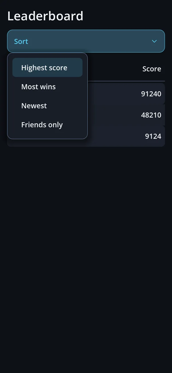
GoStyle.dropdown()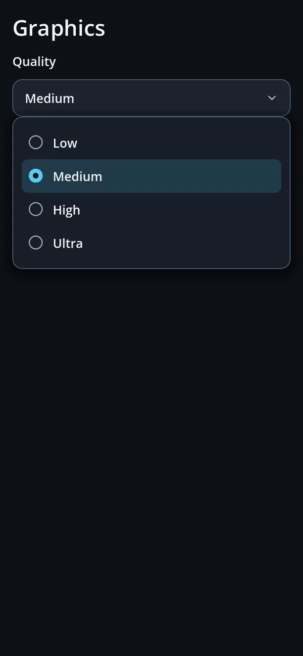
GoStyle.select()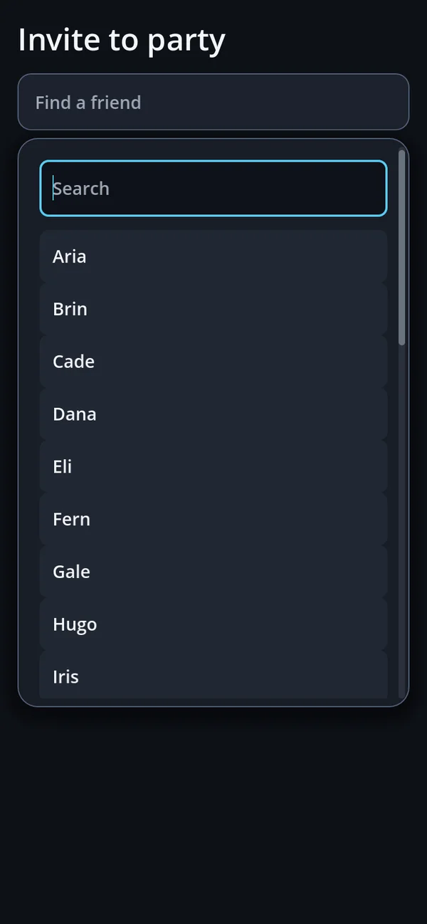
GoComboboxGoPopover — a card on the thing pressed
slot.pressed.connect(func() -> void:
    var card := GoStyle.item_card({"icon": GoIconSet.POTION, "title": "Health potion",
        "subtitle": "Heals 50 HP · 12 left"}, false)
    GoPopover.open(slot, card, {"width": 280}))
An ANCHOR surface with the layer, the anchor and the teardown already wired — the ten lines every game writes
again and again. One at a time: opening a second closes the first, because stacked cards bury the screen and nobody
can tell which belongs to which slot. The scrim is transparent — a card opened to compare gear must not darken the gear —
but it still catches the first outside tap, which closes the card and goes no further.
| Option | Default | What it does |
|---|---|---|
title | "" | A header with ×. Empty means no header. |
width · max_height | 320 · 520 | The card's size. |
dismissable | true | An outside tap closes it. |
compact · alpha · translate | false · -1 · false | Dense spacing, face opacity, title as a translation key. |
layer | 95 | The CanvasLayer it opens on. |
GoPopover.close() and GoPopover.is_open() are static. open() returns the surface — or
null when the anchor is not in the tree, so check before you await shown.close_requested.
dismissable = false and no title, nothing on screen closes it — only Escape, Back or your own call.
GoContextMenu — long-press and right-click
var menu := [
    {"text": "Use", "icon": GoIconSet.POTION, "action": use},
    {"separator": true},
    {"text": "Drop", "icon": GoIconSet.TRASH, "action": drop, "danger": true}]
GoContextMenu.attach(slot, menu)

var more := GoStyle.icon_button(GoIconSet.MORE, Callable(), -1, &"more")
more.pressed.connect(func() -> void: GoContextMenu.open_at(more, menu))- A right-click opens it at once. A finger held for half a second (
HOLD_SECONDS) opens it; moving more than 12dp cancels — so scrolling a list never pops a menu. - An item is
{text, action, icon, disabled, checked, separator, danger, translate}. Pass aCallableinstead of the array when the entries depend on what was pressed; it is called each time the menu opens. dangerputs "⚠ " before the text — the engine's menu can colour only all of its items at once.- It is the engine's
PopupMenu, dressed byGoStyle.style_popup(). It does not count as an open surface.
⋯ button
(open_at(), as above), or teach it once with a coach mark.
Dropdowns, selects and the split button
var sort := GoStyle.dropdown("Sort", ["Highest score", "Most wins", {"text": "Friends only", "disabled": true}],
    func(index: int) -> void: sort_board(index))
var quality := GoStyle.select(["Low", "Medium", "High", "Ultra"], "Quality")
quality.item_selected.connect(func(index: int) -> void: settings.quality = index)
var send := GoSplitButton.make("Send", send_now, ["Send later", "Save as draft"])
All three open the engine's popup menu: dropdown() is a MenuButton that runs an action,
select() an OptionButton that keeps a value, GoSplitButton a main action plus a menu on
its arrow (chosen(index)). Menus stay fully opaque on purpose — a menu shown in its own OS window turns
translucent pixels black.
GoCombobox — a list that searches
var friend := GoCombobox.make(friend_names, -1, "Find a friend")
friend.picked.connect(func(index: int) -> void: invite(friend_names[index]))
Pressed, it opens an anchored list on layer 96 with a transparent scrim. From search_threshold (8) entries a
search field appears and takes the focus; it matches anywhere in the text or the hint, ignoring case, and an empty result
says so. list_width (0 = the button's width, at least 180dp) sizes the list.
Popups that never stop the game
News the player can read while playing. None of these has a scrim; a tap anywhere but the card itself goes to the game.
GoSnackbar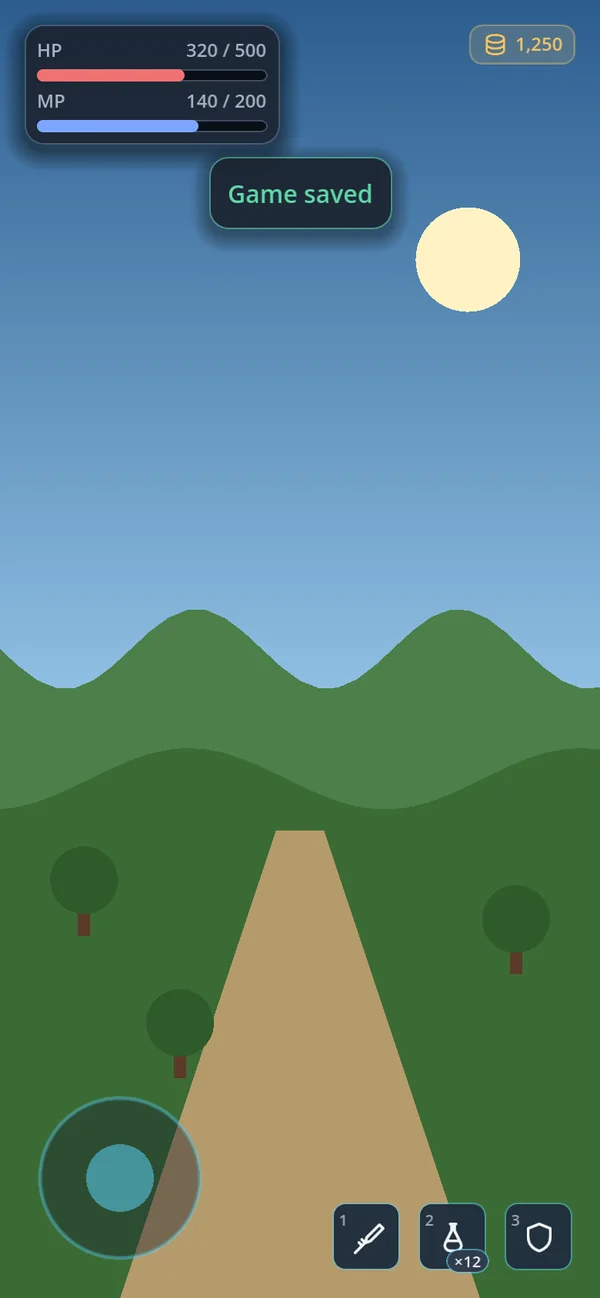
GoNoticeGoPromptCard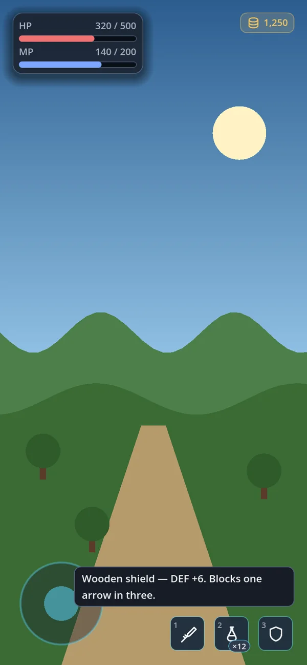
GoStyle.tooltip_node()GoSnackbar — a message with an Undo
var snack := GoSnackbar.new()
add_child(snack)

if await snack.post({"text": "Dropped {name}", "args": {"name": item.name}, "icon": GoIconSet.TRASH,
        "actions": ["Undo"], "seconds": 5.0}) == 0:
    restore(item)
Key of post() | What it does |
|---|---|
text · title · args · translate | The message, an optional bold line, {placeholders}, translation keys. |
tone · icon | The accent colour (GoTheme.SUCCESS, WARNING…) and an icon. |
actions · closable | Buttons — Strings or {text, action} — and an ×. |
seconds | How long it stays. Negative: the theme's notice_duration_ms. 0: until dismissed — give it a button then. |
post() returns the index of the button pressed, or -1 when it timed out or was dismissed. Posts
queue (queue_limit 4, the oldest dropped with -1), and the same text posted again while it shows only refills its
timer. It sits at the bottom (or the top, placement), above the safe area and the keyboard, on layer 90 — readable
over a drawer. With tap_to_dismiss (on) a tap on a card without buttons closes it; a tap off the card always
reaches the game. show_text() and show_key() are the one-line forms.
GoNotice — a line on the HUD
var notice := GoNotice.new()
hud_corner.add_child(notice)
notice.show_text("Game saved", GoTheme.SUCCESS)
notice.custom_minimum_size.x = notice.preferred_width(340)
A plain panel you place yourself — in a GoHudAnchor, in a corner, anywhere. It takes neither input nor focus,
so pressing through it reaches the button underneath, and a new message replaces the old one. Give it a width:
preferred_width(limit) returns the natural width of short text and wraps long text within limit.
set_content() shows any control instead of text.
GoPromptCard — a question that can wait
var spot := GoHudAnchor.new()
spot.spot = GoHudAnchor.Spot.TOP_CENTER
spot.reserve_space = false
spot.avoid_peers = true            # step below the health bars instead of covering them
hud.add_child(spot)

var invite := GoPromptCard.new()
spot.add_child(invite)
invite.set_icon(GoIconSet.USERS, Color.TRANSPARENT, true)
invite.set_title("Party invite from Ann")
invite.set_subtitle("Dragon's Lair · 3 / 4 members")
invite.set_actions([{"text": "Accept", "action": accept, "primary": true},
    {"text": "Decline", "action": invite.hide}])
invite.fit_width(340)
invite.show()
get_tree().create_timer(15.0).timeout.connect(invite.hide)- It starts hidden — call
show(). It has no timer of its own; add one if the question expires. - Its buttons do not close it — the actions decide. × (
set_closable(true)) emitsclosed. fit_width(width)sets the width and predicts the height from the font, so nothing laid out against it jumps a frame later.- Its face follows
hud_alpha— it is part of the HUD, not a window.
GoBanner and tooltips
GoBanner.make("You're offline.", [{"text": "Retry", "action": reconnect}], GoIconSet.WARNING) sits in the page
itself, above the content, and never times out; a button dismisses it unless it has "keep": true.
GoStyle.tooltip_node(text) is what to return from _make_custom_tooltip() — the engine draws the plate
(TooltipPanel), gohud the text, wrapped past 260dp. Tooltips are for a mouse; never hide what a player needs behind one.
Tours and the console
GoCoachMarkGoConsoleGoCoachMark — a tour of the real controls
var tour := GoCoachMark.new()
tour.keep_clear = [top_bar]
tour_layer.add_child(tour)
tour.finished.connect(func(completed: bool) -> void: save.tutorial_done = true)
tour.start([{"target": bag_button, "title": "Bag", "body": "Everything you pick up lands here."},
{"target": map_button, "title": "Map", "body": "Tap to open the full map."}])- A ring around the real control and a card beside it. Pressing the target advances (its
pressedsignal, or"signal"in the step); Next and Skip are on the card. A hidden target is skipped. - The card stays out of the middle of the screen (
avoid_center_band), off the HUD anchors and offkeep_clear. - While any
GoSurfaceis open the tour hides and waits. Back or Escape ends it withfinished(false). - It has no layer of its own — add it last, or on a layer above the HUD.
GoConsole — cheats while you build
var console := GoConsole.new()
add_child(console)
console.register("give", "give <item> <count>", func(args: PackedStringArray) -> String:
    return "gave %s x%s" % [args[0], args[1]] if args.size() >= 2 else "give <item> <count>")

func _unhandled_input(event: InputEvent) -> void:
    if event.is_action_pressed(&"dev_console"): console.toggle()
Layer 200 — above everything, so you can debug over a dialog — and it keeps running while the tree is paused. A palette suggests commands as you type; Up and Down walk the history; Escape closes it. There is no built-in key: bind your own.
debug_only (on) blocks it in a release build — both open() and run(). Cheat commands in a
player's hands end a game's economy on the first day.
Layers, Back and input
Three rules decide what the player can touch while something is open: what is on top, who owns Back, and who takes a tap.
What sits on top
| Layer | What sits there | Set with |
|---|---|---|
| 5 | Your HUD (your choice) | — |
| 10 | GoSheet | CanvasLayer.layer |
| ~50 | Your own GoSurface windows, a pause menu | your CanvasLayer |
| 80 | GoDrawer | CanvasLayer.layer |
| 90 | GoSnackbar | layer_index |
| 95 | GoPopover | "layer" option |
| 96 | GoCombobox list | — |
| 100 | GoDialogs | layer_index |
| 200 | GoConsole | layer_index |
The order is deliberate: a snackbar reports what just happened, so it reads over a drawer; a popover belongs to what was just pressed, so it sits above that; a dialog asks a question and covers both; the console covers everything, because it is what you open when the rest has gone wrong.
Who owns Back
- Only the topmost window answers. Among the open surfaces, the one on the highest layer (then the latest in the tree)
takes Escape, gamepad cancel (
ui_cancel), Android Back and scrim taps. Stacked windows close one at a time, never together. - Android Back is handled one frame later, so one press can never close two windows.
- While anything that owns Back is open, Android Back does not quit the app (
GoBackPolicycounts the owners and restoresquit_on_go_backafter the last one). Your own popup that takes Back should callGoBackPolicy.acquire()andrelease()— in_exit_treetoo. - A drawer, a coach-mark tour and a form step aside while a surface is open — Back goes to the surface first.
GoConfig.close_on_back(on) is the switch for surfaces.
Who takes a tap
- A surface covers the whole screen and stops input — a transparent scrim too. Nothing on a lower layer is pressed while it is open; layers above it (a snackbar) still are.
- Mouse-wheel and pinch gestures stop at the window as well: scrolling past the end of a list never scrolls the game.
- Gameplay input that does not go through controls —
_unhandled_inputfor movement, a camera drag — should pause:if GoSurface.is_any_open(): return. That covers dialogs, sheets, popovers and the combobox; ask a draweris_open()separately. - Snackbar, notice, prompt card and coach mark take input only on their own card; everywhere else, the game gets it.
Focus
A window opened by a pointer focuses nothing — no ring flashes for a touch. Opened from a keyboard or gamepad, the close button
(or initial_focus) takes focus. Focus stays inside the window while it is open and goes back to the control that had
it when the window closes. Dialogs focus OK every time.
Pausing the game
Pausing the tree pauses popups too — only the console keeps working. For a pause menu, give its layer
process_mode = PROCESS_MODE_ALWAYS; then the window, its buttons and Back keep running while the game is stopped.
The same popup in every look
The confirmation from the top of this page, over the same game, with only the preset changed. The code is identical — the theme, the skin and the icons do the rest.
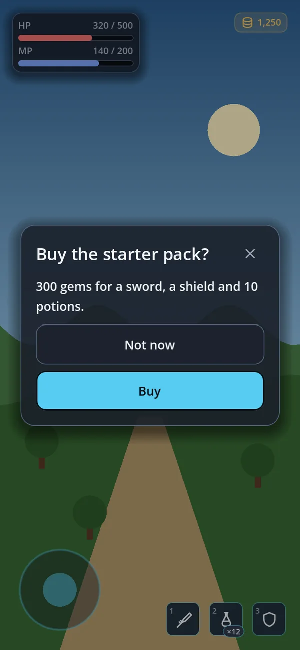
default_dark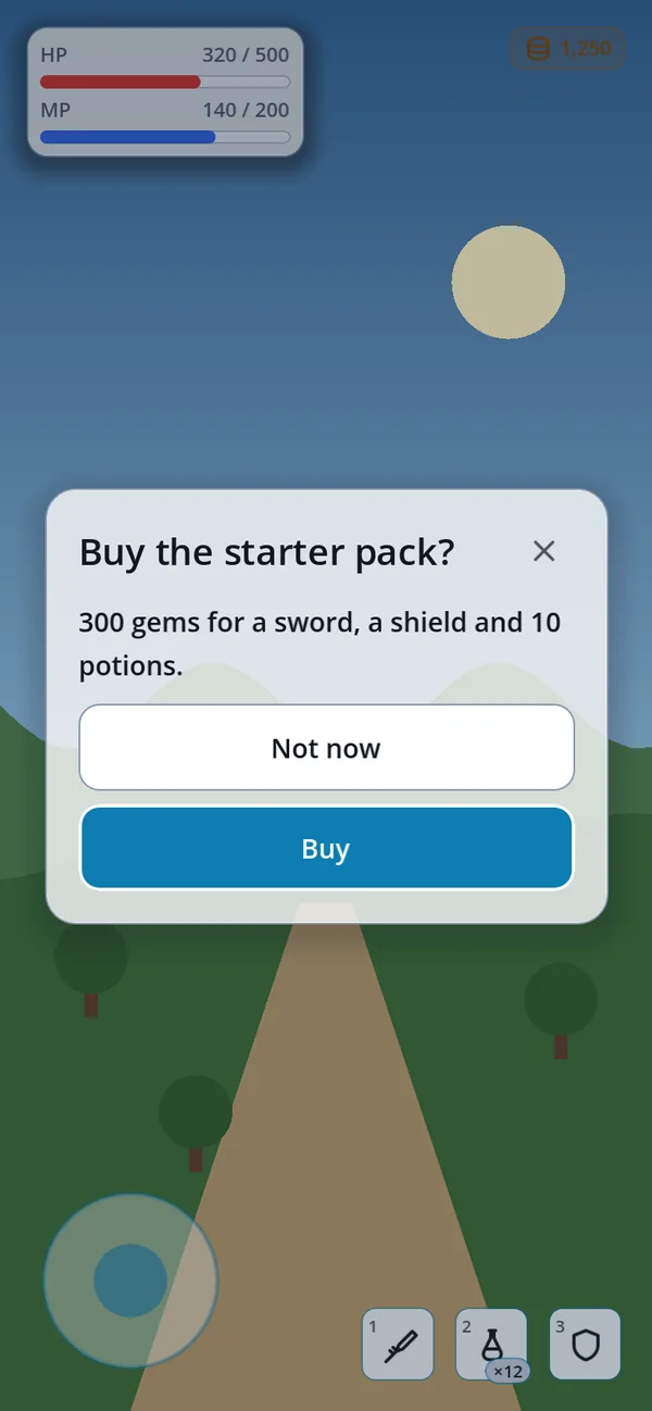
default_light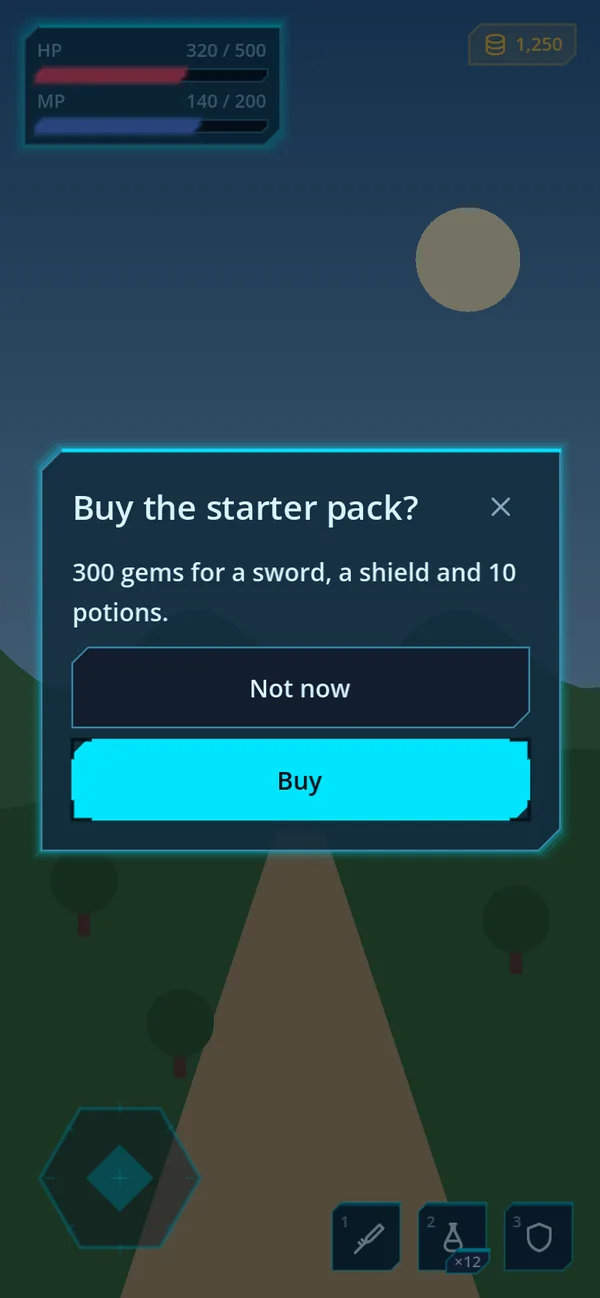
scifi_dark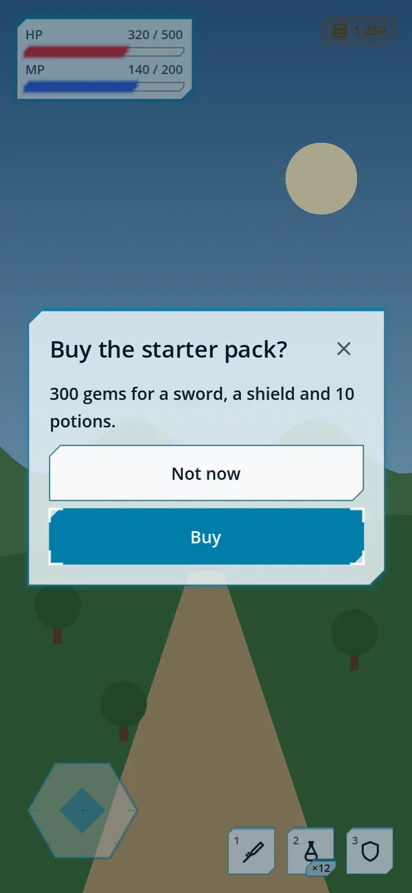
scifi_light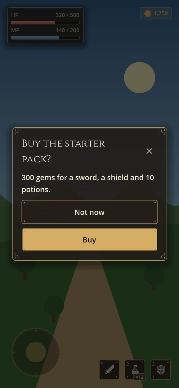
medieval_dark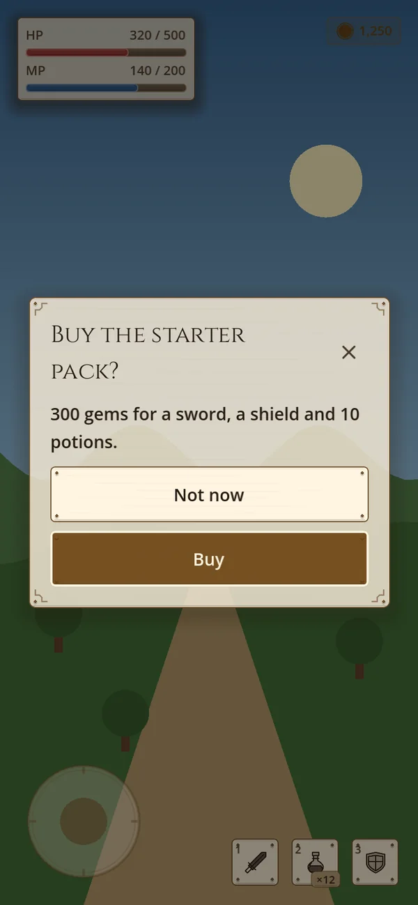
medieval_light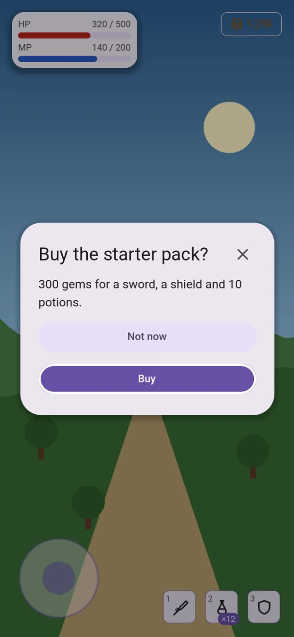
material_light New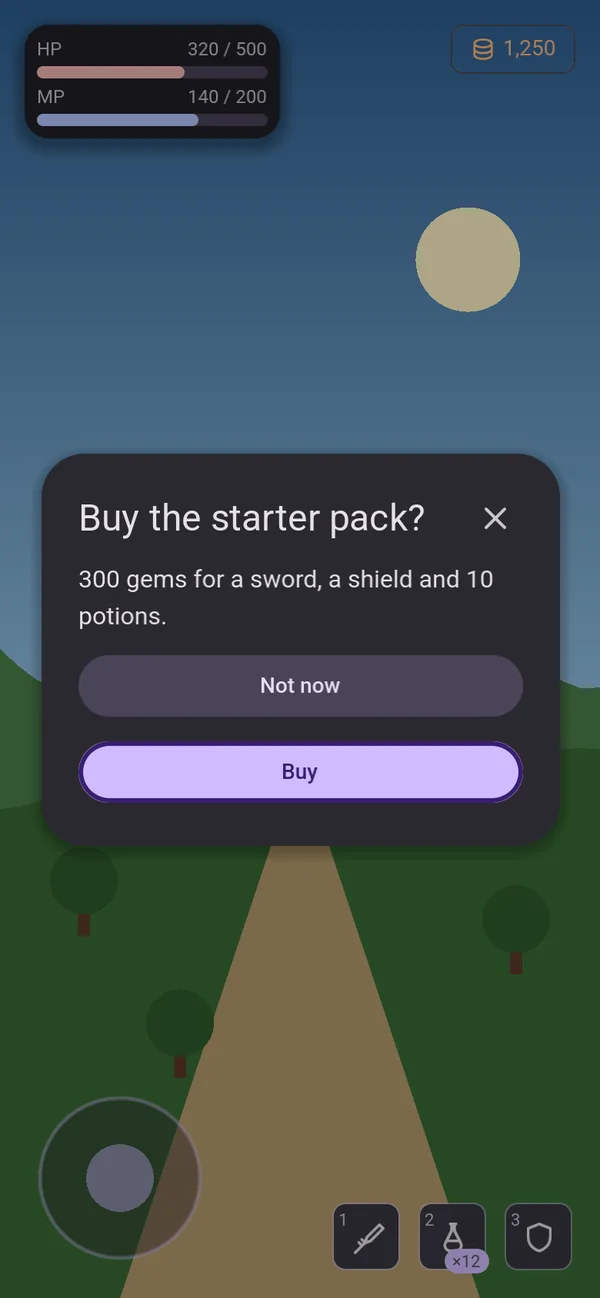
material_dark New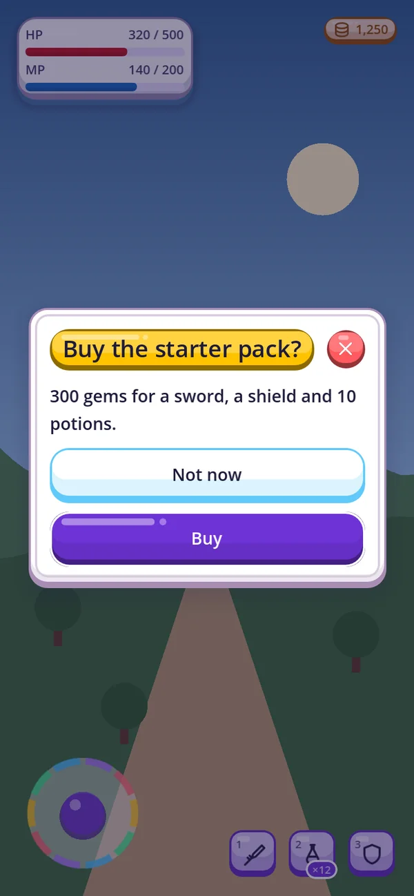
kids_light New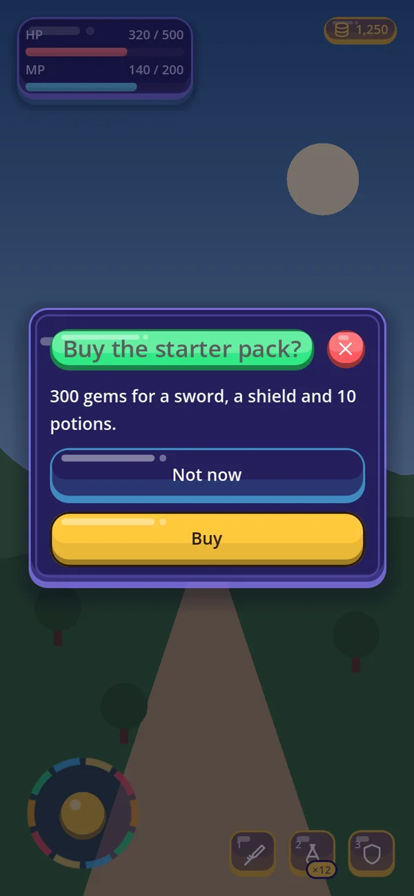
kids_dark New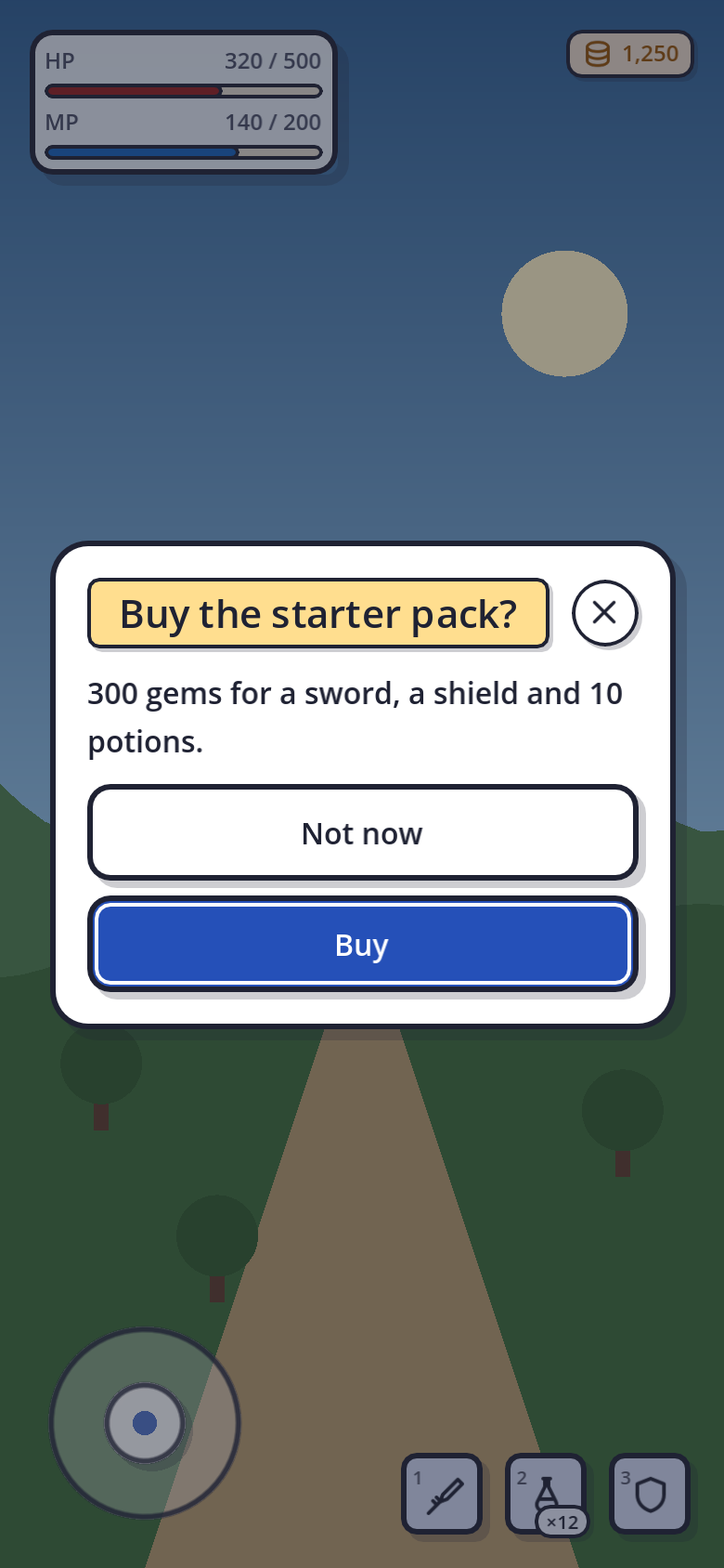
comic_light New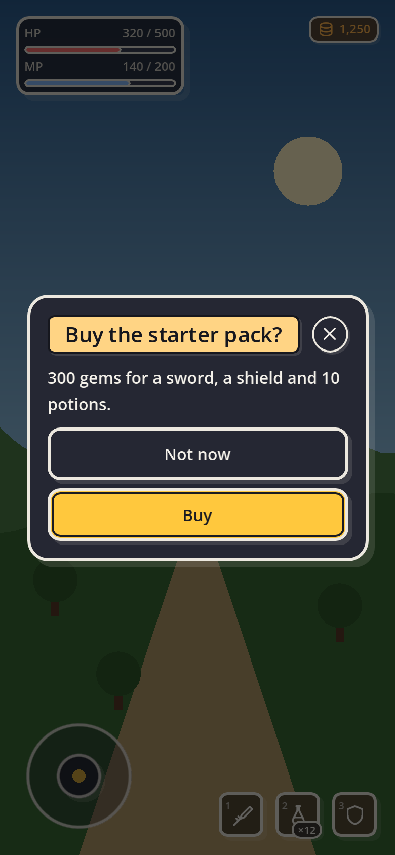
comic_dark New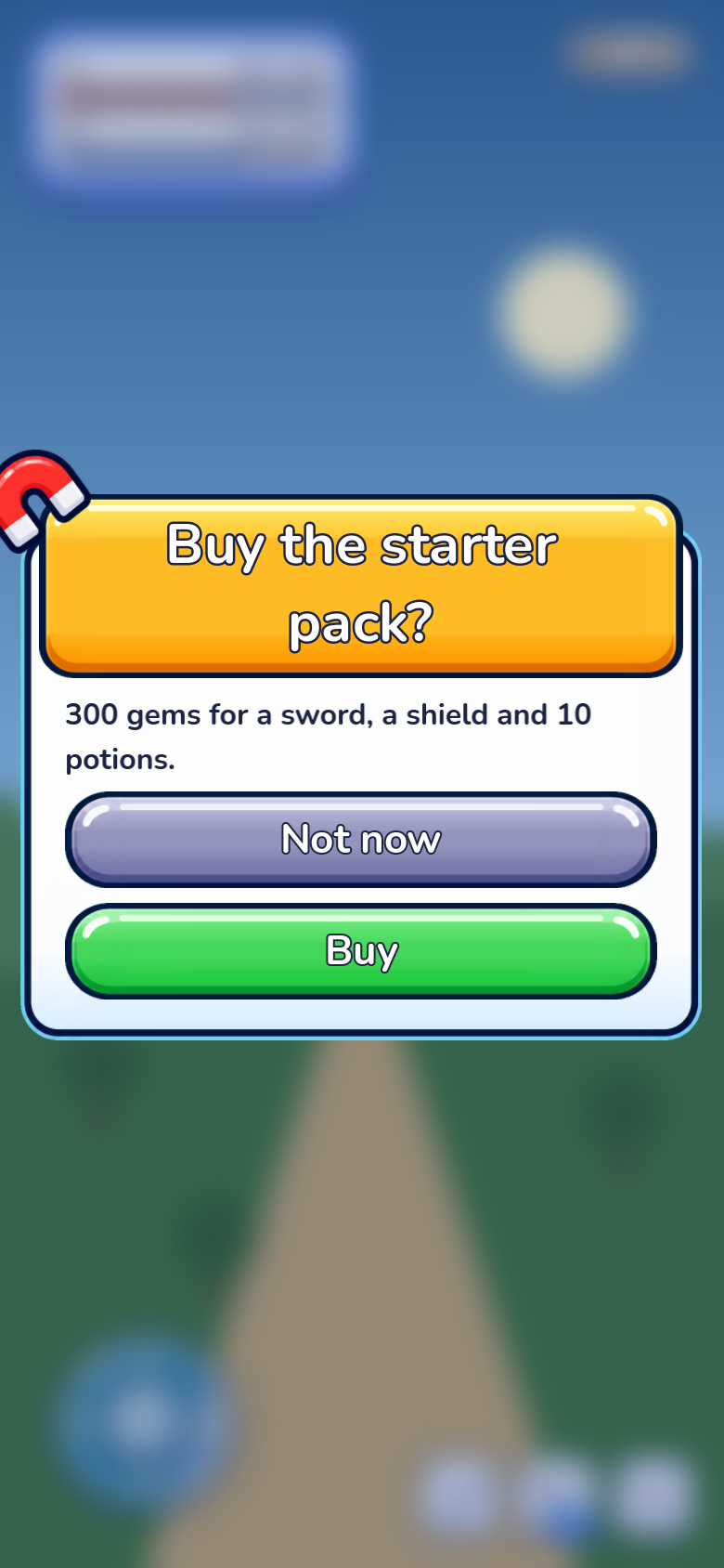
arcade_light New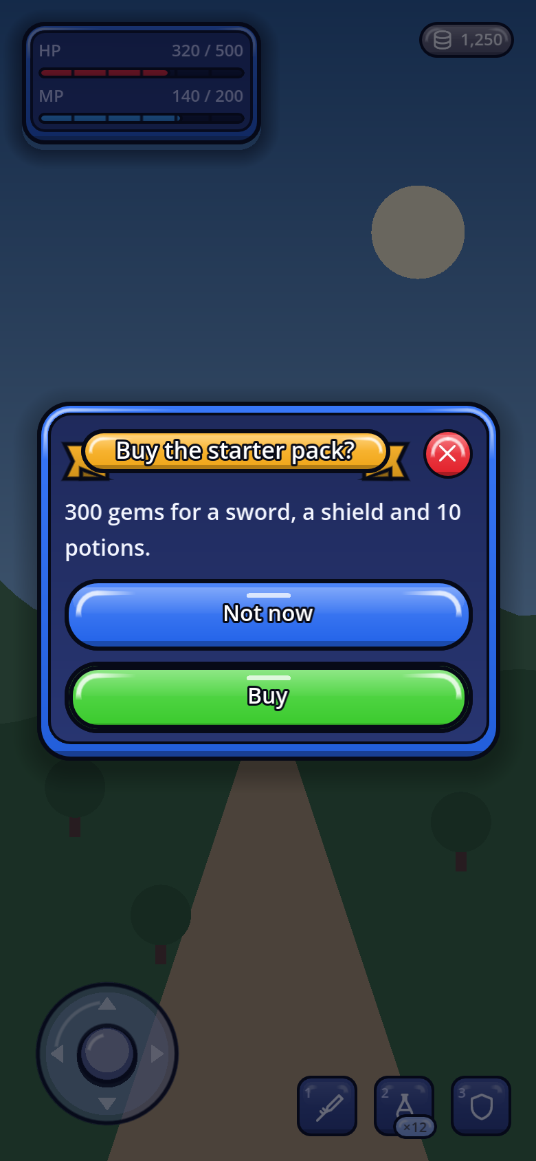
arcade_dark NewWhat each look changes
| Look | The window | Its head and buttons |
|---|---|---|
| Default | Rounded (18dp), a soft shadow, 80% opaque over the game | A plain title and ×; primary buttons lift and sink |
| Sci-fi | Cut corners with a neon edge and glow, the edge tinted by the accent | Bracket focus marks |
| Medieval | A forged frame — iron and leather, or parchment — with rivets and corner ornaments | Titles in Cinzel |
| Material 3 | 28dp corners, 24dp padding, fully opaque | A 24sp headline in Roboto; pill buttons with a 40dp plate in a 48dp target |
| Kids | A jelly-candy card with a soft shadow, fully opaque | A sunny title ribbon (mint at night), a round candy close button, buttons that squish when pressed |
| Comic | A bold ink outline and a hard shadow, fully opaque | A yellow title caption, an inked round close button, buttons whose shadow goes when pressed |
| Arcade | A thick board — a coloured frame round a pale well — fully opaque | A gold title banner with a white, ink-outlined title, a round red close key, painted keys that pop when pressed |
Dress a popup from a skin
A skin decides the parts a Theme cannot reach. These hooks are the ones popups call — override them in your own
GoSkin subclass; by default they do nothing.
| Hook | What it dresses |
|---|---|
title_plate_box() · title_plate_ink() · title_plate_min_size() | A plate behind a window's title. The title centres on it and shrinks, down to the minimum size (15), to stay on one line. |
dress_close_button(button) | The window's × — kids makes it a round candy, comic an inked disc, arcade a round red key. |
dress_title(label) | The window's title label — arcade outlines its white title in ink. |
press_feedback(control) | Runs the moment a finger lands on a button gohud made — kids squishes it, arcade pops it. |
floating_box() · notice_box() · drawer_box() · banner_box() · overlay_box() | The faces of prompt cards and coach cards, snackbars and notices, the drawer, banners, the console. |
coach_ring_box() · draw_coach_pointer() | The tour's ring and pointer. |
How see-through
Each kind of popup follows its own opacity, so a HUD card can stay light while a dialog stays solid: windows, sheets, dialogs,
popovers and the combobox follow panel_alpha; the drawer and coach card card_alpha; prompt cards and the
console hud_alpha; snackbars and notices notice_alpha; menus popup_alpha. Material and kids
make them all opaque; comic too, except prompt cards and the console at 92%, and arcade, except those two at 94%. Override one kind with GoConfig.container_alpha_overrides, all of them with
container_alpha (a ratio — 0.95), or one window with its alpha. Only the face fades; text is
never see-through. Opacity in detail →
Settings that shape every popup
Fields of GoConfig (GoUi.config). A few are copied when a window is created, so set them
before building the UI — or call GoUi.refresh() after changing them.
| Field | Default | What it does |
|---|---|---|
surface_max_width · surface_max_height | 480 · 700 | The largest a window gets. |
surface_height_ratio · surface_max_height_ratio | 0.68 · 0.72 | The usual height and the cap (also the drag limit). |
surface_fit_max_height_ratio | 0.94 | How far a centred fit-content card may grow before it scrolls. |
surface_width_ratio_portrait · …_landscape | 0.94 · 0.72 | Width as a share of the room. |
dismiss_on_scrim | false | A scrim tap closes windows and dialogs. Copied when the window is created. |
surface_fade_in · fade_seconds | false · 0.14 | Fade windows in, and how fast. |
close_on_back | true | Escape, ui_cancel and Android Back close the topmost window. |
close_button_visual | 36 | How big × looks — its touch target stays 48dp. |
suppress_pointer_focus_ring | true | No focus ring when a window is opened by touch or mouse. |
container_alpha · container_alpha_overrides | -1 · {} | Opacity of every face, or per kind (GoTheme.BOX_*). |
reduce_motion | false | No fades, slides, pulses or squishes. |
min_touch_size | 48 | The height of prompt-card and coach-mark buttons. |
respect_safe_area | true | Keep windows off the notch and the gesture bar. |
text_keys · text_overrides | — | The kit's own words: close, back, confirm, cancel, next, done, skip, search, empty… |
sound_cues · haptics | — | What GoFeedback plays on opened, closed, confirmed, canceled and tapped. |
Recipes
Copy, paste, change the words. Every call here is checked against the source.
A purchase with the price in it
func buy(item_name: String, price: int) -> void:
    if await dialogs.confirm("Buy {item}?", "It costs {price} gold.", "Buy", "", "",
            {"item": item_name, "price": price}):
        purchase(item_name)
A settings window with a pinned Save
func open_settings() -> void:
    var layer := CanvasLayer.new()
    layer.layer = 50
    add_child(layer)
    var window := GoSurface.new()
    window.set_title("Settings")
    window.dismiss_on_scrim = true
    window.close_requested.connect(layer.queue_free)
    window.body.add_child(GoStyle.section("Sound", false))
    window.body.add_child(GoStyle.toggle("Music", false))
    window.body.add_child(GoStyle.slider(0.0, 1.0, 0.05))
    var row := GoStyle.row()
    row.add_child(GoStyle.button("Cancel", window.request_close))
    row.add_child(GoStyle.button("Save", func() -> void:
        save_settings()
        layer.queue_free(), GoStyle.Tone.PRIMARY))
    window.footer.add_child(row)
    window.footer.visible = true
    layer.add_child(window)
A form that says what is wrong
var field := GoField.make("Name", GoStyle.line_edit(), "3–12 letters")
window.body.add_child(field)
create_button.pressed.connect(func() -> void:
    if name_is_taken():
        field.set_error("That name is taken")
        window.set_status_text("Name check failed", GoTheme.DANGER)
    else:
        window.clear_status()
        create_character())
A date in a sheet
sheet.open("Delivery date")
var picker := GoDatePicker.make({"year": 2026, "month": 10, "day": 14}, func(date: Dictionary) -> void:
    delivery = date
    sheet.close())
picker.min_date = GoDatePicker.today()
sheet.body.add_child(picker)
A pause menu
func pause() -> void:
    get_tree().paused = true
    var layer := CanvasLayer.new()
    layer.layer = 50
    layer.process_mode = Node.PROCESS_MODE_ALWAYS      # keeps running while the game is paused
    add_child(layer)
    var menu := GoSurface.new()
    menu.set_title("Paused")
    menu.close_requested.connect(func() -> void:
        get_tree().paused = false
        layer.queue_free())
    menu.body.add_child(GoStyle.button("Resume", menu.request_close, GoStyle.Tone.PRIMARY))
    menu.body.add_child(GoStyle.button("Settings", open_settings))
    menu.body.add_child(GoStyle.button("Quit to title", quit_to_title, GoStyle.Tone.DANGER))
    layer.add_child(menu)
Gameplay that waits for popups
func _unhandled_input(event: InputEvent) -> void:
    if GoSurface.is_any_open() or drawer.is_open():
        return
    handle_gameplay(event)
Pitfalls
- A
GoSurfacenever frees itself. Connectclose_requested, or × does nothing. - Options set after
add_child—scrim_transparent,show_header,resizable,scroll_body, andGoDialogs'layer_indexandmax_width— are not applied. - A second
confirm()returnsfalseat once. Turn onqueue_when_busyif two questions can meet. - Enter confirms. OK has the focus, on destructive dialogs too.
- Back on a sheet closes the sheet, not the sub-page.
- Escape does not close a drawer, and
is_any_open()does not see one. - A popover or combobox list blocks the game until it closes, even with a transparent scrim — and a popover with
dismissable = falseand no title has nothing on screen that closes it. - A prompt card starts hidden and has no timeout.
- A snackbar with
seconds: 0and no button never leaves. And it catches taps on its card by default. - A long press nobody knows about is a feature nobody uses. Show a
⋯too. - A paused tree pauses your popup. Use
PROCESS_MODE_ALWAYSon its layer. - A notice without a width collapses to its narrowest — use
preferred_width(). - Never ask in a snackbar, never inform in a dialog. A question goes away when ignored; news should not stop the game.