What it looks like in a game
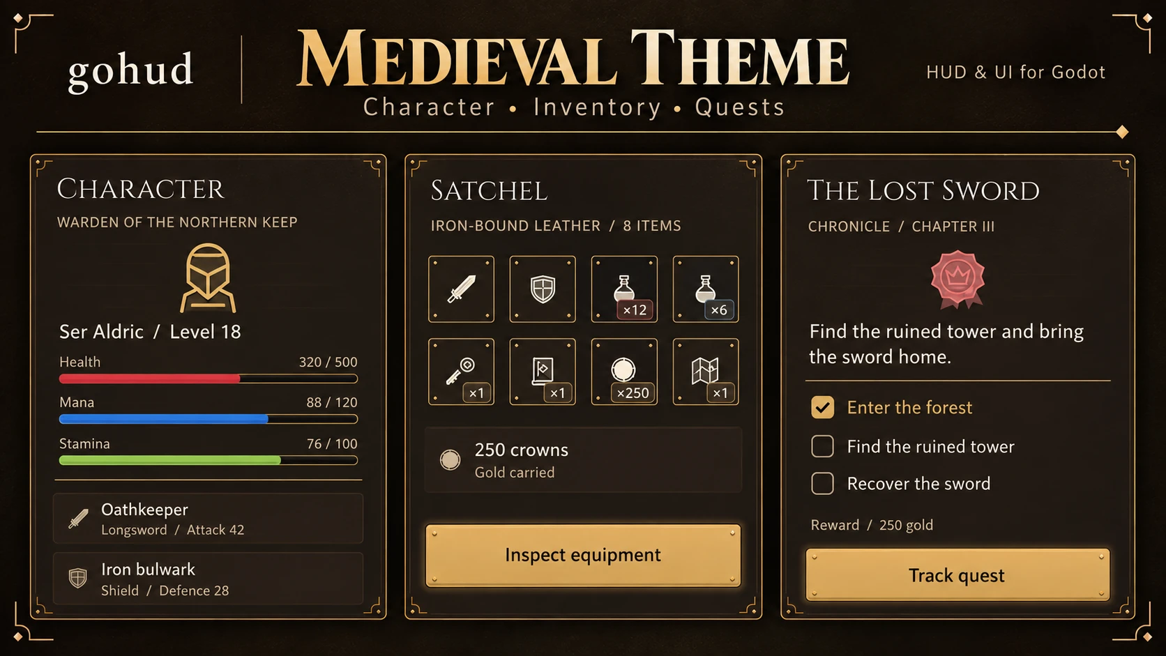
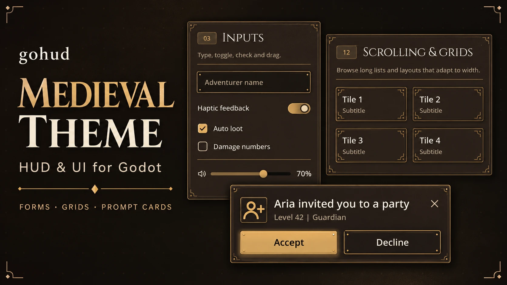
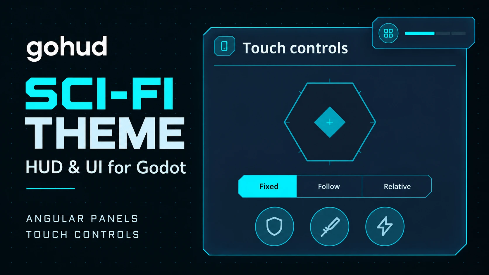
The medieval and sci-fi presets — character sheets, inventories and quests; forms, grids and prompt cards; angular panels and touch controls. Switching presets is one line of code.
What it takes off your hands
What costs the most time in game UI is not the shape of a button — it is everything that drifts apart between devices. gohud handles that drift in one place.
Every measurement is a token
Spacing, corners and text sizes are called by name, not written as numbers. Swap the theme and the whole screen moves with it.
Visible size ≠ pressable size
A close button looks 36dp but its touch target is 48dp. Where crowded slots overlap, the one whose centre is nearer takes the press.
Notches and keyboards
HUD pieces sit inside the safe area, and an input rises above the virtual keyboard when it appears.
Back closes one thing
Escape and Android Back close only the topmost surface. Stacked windows do not vanish together.
Notices never steal input
Press through a snackbar and the button underneath receives it. Focus is not taken either.
Icons are asked for by name
Widgets only know GoIconSet.CLOSE. Swap the set and every drawing changes without touching a line of code.
Six looks, one line
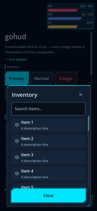
GoUi.use_preset() swaps theme, skin and icons together — rounded, chamfered sci-fi or forged medieval frames.
Legible by measurement
Every theme is checked against WCAG, including button states and translucent HUD panels over pure white and pure black.
Install gohud
Two ways in. Let your AI agent do it, or drop the folder into your project — there is nothing else to set up.
Quick start
Five lines put a themed screen on the display. See the whole walk-through on the install page.
Change the look — colours and shape
A Theme can only restyle what the engine draws. Rounded corners are the only corners StyleBoxFlat has, and the joystick, quick slots and coach mark are drawn by code — so a theme alone can never change their shape. gohud therefore ships presets: a theme, a skin and an icon set picked as one unit.
GoUi.use_preset(GoThemePresets.MEDIEVAL_DARK) # theme, skin and icons together| Preset | Look |
|---|---|
default_dark | The original gohud — rounded corners, soft blue accent |
default_light | The same shapes on a light palette |
scifi_dark | Chamfered corners, cyan neon edges and glow, hexagonal joystick, targeting brackets |
scifi_light | The same angular shapes in a bright blueprint palette |
medieval_dark | Dark iron and leather, antique-gold frames, rivets, engraved icons, Cinzel headings |
medieval_light | Parchment, ink and bronze with the same forged frames |
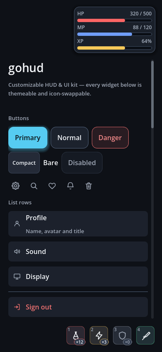
default_dark — rounded corners, soft blue accent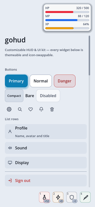
default_light — same shapes, light palette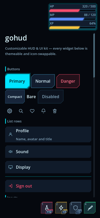
scifi_dark — chamfered corners, cyan neon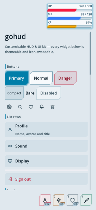
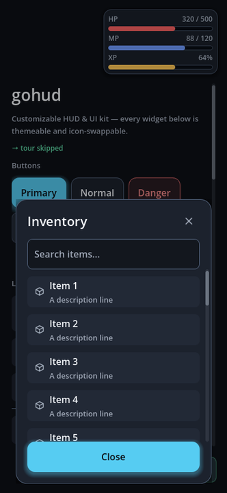
scifi_light — same angular shapes, blueprint paletteThose four are the same gallery screen. Not a line of code differs — only the preset name. Button corners, toggle shapes, list rows and input borders all move together.
Medieval collection
medieval_dark pairs iron and leather with antique gold; medieval_light uses parchment
and ink. Menu frames carry a rivet and a small corner ornament while the always-visible HUD stays quiet;
16 engraved icons redraw the item names, and only titles and subtitles use the bundled Cinzel font.
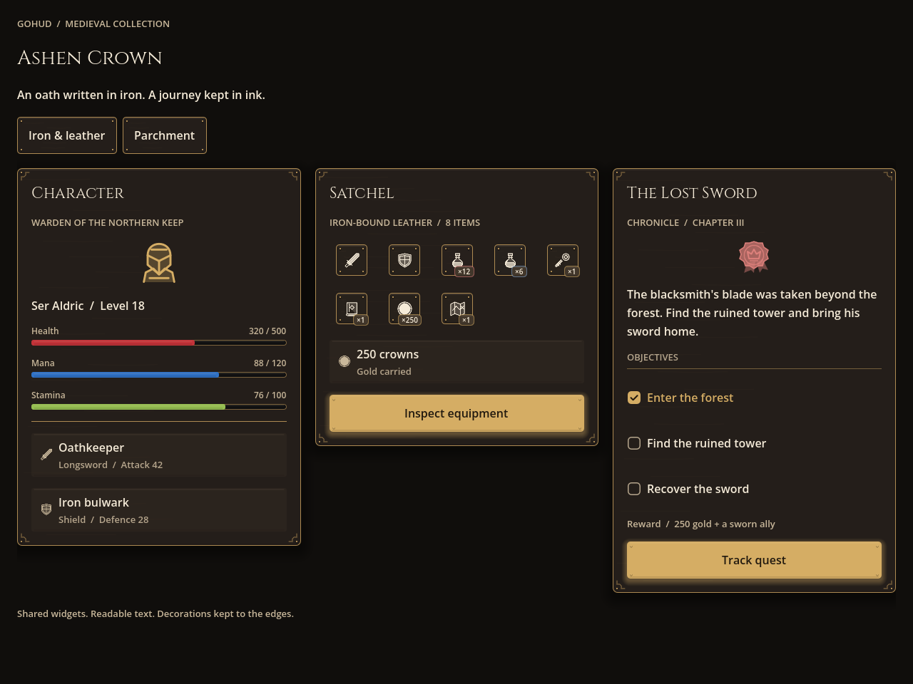
medieval_dark — iron and leather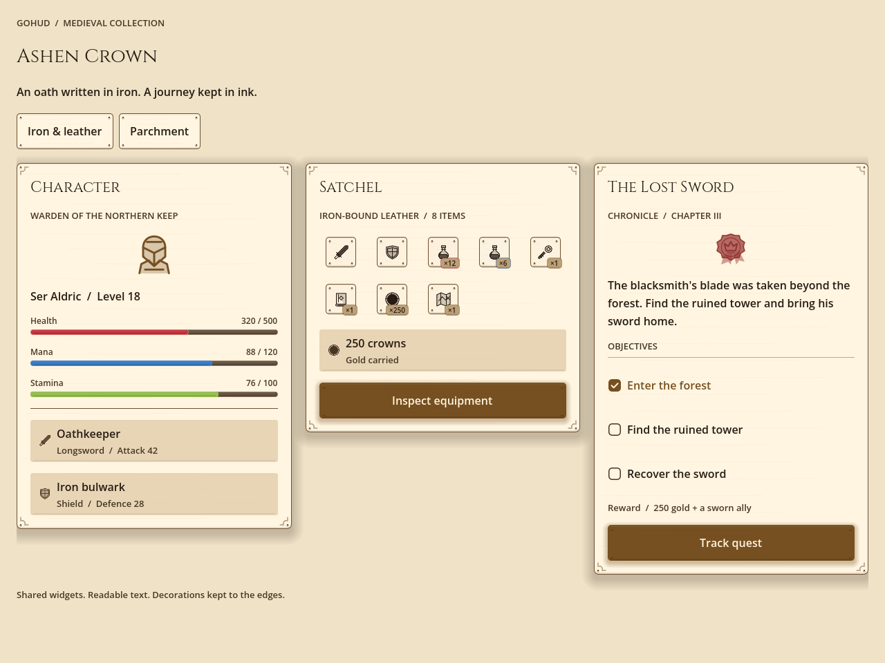
medieval_light — parchment and inkBoth shots are examples/medieval/medieval.tscn, built from the standard widgets.
The medieval guide and how to make your own kingdom →
The same screen on a phone and on a desktop
The gallery shots are a phone in portrait. Below is the same code at 1280×800 — the content stops at a readable width (480dp) and centres, while the HUD stays in the corners. The form steps around floating HUD pieces, but does not move when it is already clear of them: pushing anyway would throw the content off-centre on a wide screen.
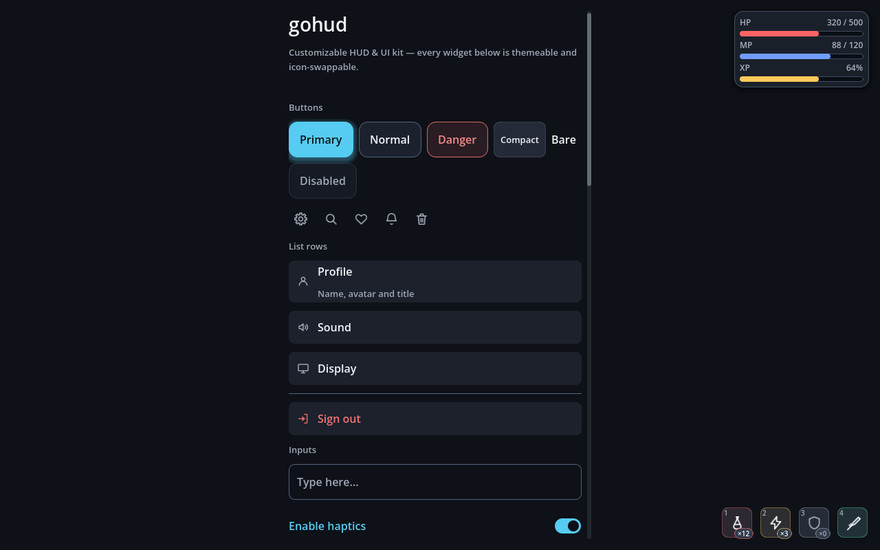
default_dark · 1280×800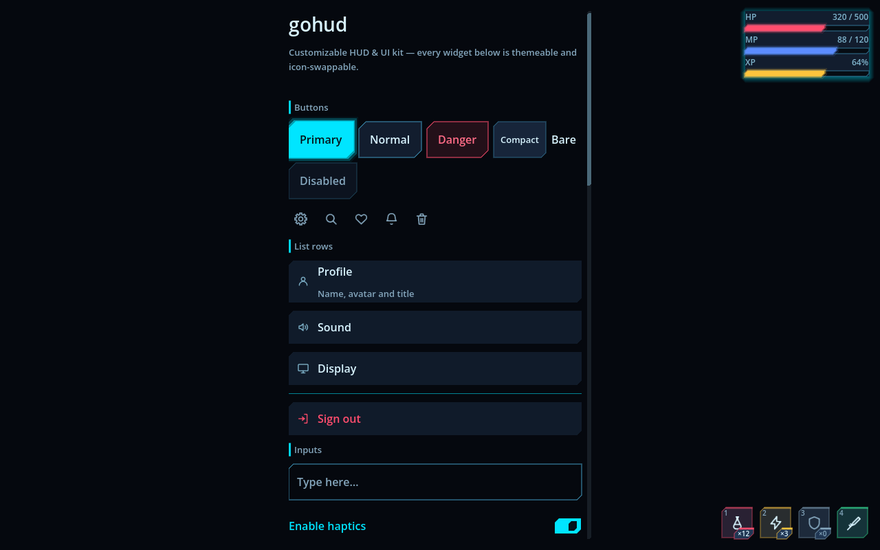
scifi_dark · 1280×800The same sheet, a different look
Pick one from Project Settings → gohud → Theme → Preset, or set GoConfig.preset.
Filling in theme, skin or icons explicitly wins over the
preset, so you can take a preset and override just one of them.
new_theme.py kingdom --from medieval_dark writes a palette that
spells out every inherited value; make_theme.py kingdom builds the theme, its control artwork and
its skin dials, and the preset appears in the picker. Every setting and dial →
Skins — where a Theme cannot reach
A skin owns the joystick, quick-slot faces, the coach-mark ring, chips, skeletons, alerts, dividers and section headings. Subclass it and override only what you want changed.
class_name MySkin extends GoSkin

func slot_box(accent: Color, lit: bool) -> StyleBox:
    var box := GoStyleBoxCut.new()
    box.bg_color = accent
    box.cut = 6.0
    box.edge_color = accent
return box| Class | Shapes it can make |
|---|---|
GoStyleBoxCut | Diagonally cut corners (chamfer), one thickened accent edge, an outer glow |
GoStyleBoxBracket | Corner marks only, without enclosing the content |
GoStyleBoxMedieval | A forged frame with rivets, corner engraving, a bevel highlight and material grain |
All three serialise into a Theme resource — which is what lets a theme change shape, not just colour.
GoSkinSciFi and GoSkinMedieval are the shipped subclasses.
GoStyle.box() always returns a StyleBoxFlat, because calling code
receives it and adjusts bg_color or corner_radius. Use
GoStyle.surface() when a custom shape has to survive.
Widgets
The pieces, in one table. Each one in detail →
| Class | Base | What it does |
|---|---|---|
GoSurface | Control | Floating card shell — centre, bottom or anchored placement, sticky header and footer, scrolling body, drag-to-resize |
GoSheet | CanvasLayer | Pages rising from the bottom, on their own layer so they sit above the HUD |
GoDialogs | Node | Confirmations and alerts you await; destructive for irreversible actions |
GoForm | MarginContainer | Width-capped forms that avoid the virtual keyboard and, with avoid_hud, the HUD |
GoScroll | ScrollContainer | Touch scrolling; the scrollbar tucks into the card padding |
GoNotice | PanelContainer | A snackbar that takes neither input nor focus |
GoPromptCard | PanelContainer | A question that does not block the game |
GoCoachMark | Control | A guided tour that points at real controls; pressing the target advances |
GoHudAnchor | Control | Pins HUD pieces to one of nine safe-area spots |
GoBar | Control | Health, mana and experience bars with eased changes |
GoSlot | Button | A quick slot — icon, quantity, cooldown and shortcut on one face |
GoJoystick | Control | Virtual stick in fixed, follow or relative mode |
GoIconButton | Button | Looks small, presses large |
GoStyle | static | Buttons, list rows, inputs, chips, tables, tabs and more, made one consistent way |
Waiting, telling, counting
| Class | Base | What it does |
|---|---|---|
GoSnackbar | Node | the message that places itself |
GoSpinner | Control | a wait with no end in sight |
GoBadge | PanelContainer | the unread dot, the NEW tag, the 99+ |
Forms and lists
| Class | Base | What it does |
|---|---|---|
GoField | VBoxContainer | the row that can be wrong |
GoInputGroup | HBoxContainer | an input welded to its button |
GoCombobox | Button | a picker that searches |
GoCodeInput | VBoxContainer | coupon and gift codes |
GoTable | VBoxContainer | sortable headers, selectable rows |
GoPagination | HBoxContainer | pages, or a More row |
Shapes games actually use
| Class | Base | What it does |
|---|---|---|
GoRewardCalendar | VBoxContainer | daily attendance |
GoRadar · GoDonut | Control | stats at a glance |
GoCarousel | VBoxContainer | banners and character select |
GoKbd | HBoxContainer | key hints that do not lie |
Over the screen
| Class | Base | What it does |
|---|---|---|
GoDrawer | CanvasLayer | the side panel |
GoPopover | RefCounted | the anchored card |
GoContextMenu | RefCounted | long-press and right-click |
GoConsole | CanvasLayer | the developer console |
AI SKILL
gohud ships an AI skill: the whole API, runnable templates and a preview launcher. Paste one block into your coding agent and it installs gohud and knows how to use it.
Readability is measured, not eyeballed
"Pretty" is taste; "legible" can be measured. Faint grey text looks fine on a good monitor and disappears on a phone in daylight — picking by eye guarantees it eventually.
python3 addons/gohud/tools/check_contrast.pyEvery colour pair and every button state's label over the panel it sits on is measured against WCAG, in all six themes. Translucent colours are composited over their real backdrop first — measuring them directly reports a better ratio than the screen shows.
Text colours are therefore derived, not chosen: the builder takes the palette entry as a starting point and pushes its lightness until it clears the threshold on every surface it can land on. Change the palette and the contrast follows. The rules and the traps behind them →
Checks, releases and this site
One entry point runs every check; each part sees something the others cannot.
bash addons/gohud/tools/check_all.sh| Check | What it catches |
|---|---|
run_tests.sh at four screen sizes | Widget behaviour and layout, RTL positions, keyboard focus, runtime skin contrast, every preset |
new_project_check.sh | Hidden dependencies on a host project; with --zip the release as shipped, with --export a Web build |
check_contrast.py | WCAG contrast of every theme file, button states and translucent panels included |
check_generated.py · check_scaffold.sh | Generated themes match their palettes; a throwaway theme builds and passes contrast |
check_package.py | The version taken from package.json, changelog moves and ZIP contents, in temporary copies |
check_site.py | This site's links, anchors, page language, glossary and dial tables |
Release versions
cat addons/gohud/package.json       # { "version": "1.1.0" }
bash addons/gohud/tools/package.sh  # 1.1.0 → builds/1.1.0/gohud-1.1.0.zip
The version is the one written in package.json — packaging never raises it. To release a new
version, change that number first. A successful run sets plugin.cfg and GoUi.VERSION
to it and, the first time that version is packaged, moves the Unreleased notes of CHANGELOG.md into
a dated entry. Packaging the same version again rebuilds its ZIP and replaces the old one. A failed run changes
nothing. The ZIP leaves out this website, the tests, the tools and package.json.
This site
python3 addons/gohud/tools/make_site.py            # glossary and skin-dial tables, generated from source
python3 addons/gohud/tools/check_site.py           # links, anchors, language, glossary, generated tables
bash addons/gohud/tools/site_shots.sh /tmp/shots   # desktop and phone screenshots of every page
The pages are plain HTML in www/ — English at the root, Korean in ko/. A GitHub
Actions workflow publishes that folder as the site root.