Social Kit
Beautiful UI Kit for soical like apps.
Widgets
WaveCarouselEntry
- This displays an entry style widget. It does not have a scaffold. Meaning you can add it in a screen if you want.
-
It is best fit on mobile size.
-
logois a widget that is displayed at the center-left. You can put whatever widget there. -
backgroundis a widget to put as a background. Or the background will be the background color of the theme. -
bottomStrokeis the width of the bottom line at the bottom of photos. Ex: 5 -
bottomStrokeColoris the color ofbottomStroke. Ex: Colors.blue -
startis the button at the very bottom to display "CONTINUE" OR "GET STARTED". -
autoSwipleIntervalis the interval in ms to swipe next slide. It must be bigger than 100 to activate the auto swipe. -
itemsis an array that has the title, subtitle and the photo to display in the carousel. -
titleSpacingis the spacing betweentitleandsubtitle. -
bottomGradientis a widget that displays a graide at the bottom of the photos. Since it is a widget, you can put whatever UI as thebottomGraident. -
indicatorColoris the color of inactive pagination indicator. indicatorActiveColoris the color of active pagination indicator.
Sleep Walker
-
You can move around a widget in a stack. It is useful to give some decoration under the stack.
-
The speed of the each move is set by the starting point of the
duration. Meaning, the speed of the current position to next position is depends on thedurationof the current position. So, the lastdurationis ignored.
import 'package:flutter/material.dart';
import 'package:social_kit/social_kit.dart';

class SleepWalkerScreen extends StatefulWidget {
  static const String routeName = '/SleepWalker';
  const SleepWalkerScreen({super.key});

  @override
  State<SleepWalkerScreen> createState() => _SleepWalkerScreenState();
}

class _SleepWalkerScreenState extends State<SleepWalkerScreen> {
  @override
  Widget build(BuildContext context) {
    return Scaffold(
      appBar: AppBar(
        title: const Text('SleepWalker'),
      ),
      body: Stack(
        children: [
          const Text("SleepWalker"),
          SleepWalker(
            alignments: const [
              (
                alignment: Alignment.topLeft,
                duration: Duration(milliseconds: 2000),
              ),
              (
                alignment: Alignment.topRight,
                duration: Duration(milliseconds: 700),
              ),
              (
                alignment: Alignment.bottomRight,
                duration: Duration(milliseconds: 400),
              ),
              (
                alignment: Alignment.bottomLeft,
                duration: Duration(milliseconds: 300),
              ),
              (
                alignment: Alignment(.7, .2),
                duration: Duration(milliseconds: 200),
              ),
              (
                alignment: Alignment(-1, -1),
                duration: Duration(seconds: 1),
              ),
            ],
            child: Container(
              width: 200,
              height: 200,
              color: Colors.blue,
            ),
          ),
        ],
      ),
    );
  }
}
- Use case; You may add a background that moves in a screen. Add a child widget that has some blurred shapes and rotatation.
Combination of WaveCarouselEntry and SleepWalker
- You can give a decoration of SleepWalker to the background of WaveCarouselEntry.
import 'package:cached_network_image/cached_network_image.dart';
import 'package:flutter/material.dart';
import 'package:social_kit/social_kit.dart';

class EntryScreen extends StatefulWidget {
  static const String routeName = '/Entry';
  const EntryScreen({super.key});

  @override
  State<EntryScreen> createState() => _EntryScreenState();
}

class _EntryScreenState extends State<EntryScreen> {
  @override
  Widget build(BuildContext context) {
    return Scaffold(
      body: WaveCarouselEntry(
        autoSwipeInterval: 3000,
        bottomStroke: 8,
        bottomStrokeColor: Colors.grey,
        titleSpacing: 16,
        start: ElevatedButton(
          onPressed: () {
            Navigator.pop(context);
          },
          child: const Text('CONTINUE'),
        ),
        logo: Container(
          width: 72,
          height: 72,
          decoration: const BoxDecoration(
            shape: BoxShape.circle,
            color: Color(0xFFffe1f1),
          ),
          child: ClipOval(
            child: CachedNetworkImage(
              imageUrl: 'https://picsum.photos/250/?image=400',
              fit: BoxFit.cover,
            ),
          ),
        ),
        items: [
          (
            title: Text(
              "Casual Talk",
              style: Theme.of(context).textTheme.titleLarge,
            ),
            subtitle: Text(
              "Please join casual and enjoyable conversations with potential matches using our meeting app. Easily connect and chat.",
              style: Theme.of(context).textTheme.labelMedium!.copyWith(
                    color: Colors.grey,
                    fontWeight: FontWeight.w400,
                  ),
              textAlign: TextAlign.center,
            ),
            image: CachedNetworkImage(
              imageUrl: 'https://picsum.photos/250?image=90',
              fit: BoxFit.cover,
            ),
          ),
          (
            title: Text(
              "Extends Social Circle",
              style: Theme.of(context).textTheme.titleLarge,
            ),
            subtitle: Text(
              "Discover interesting individuals to connect with. Our meeting app makes it easy to broaden your horizons and meet diverse people.",
              style: Theme.of(context).textTheme.labelMedium!.copyWith(
                    color: Colors.grey,
                    fontWeight: FontWeight.w400,
                  ),
              textAlign: TextAlign.center,
            ),
            image: CachedNetworkImage(
              imageUrl: 'https://picsum.photos/250?image=100',
              fit: BoxFit.cover,
            ),
          ),
          (
            title: Text(
              "Discover New Connections",
              style: Theme.of(context).textTheme.titleLarge,
            ),
            subtitle: Text(
              "Our meeting app is designed to help you find new connections and expand your social circle. Join us and meet new people.",
              style: Theme.of(context).textTheme.labelMedium!.copyWith(
                    color: Colors.grey,
                    fontWeight: FontWeight.w400,
                  ),
              textAlign: TextAlign.center,
            ),
            image: CachedNetworkImage(
              imageUrl: 'https://picsum.photos/250?image=110',
              fit: BoxFit.cover,
            ),
          ),
          (
            title: Text(
              "Meaningful Connections",
              style: Theme.of(context).textTheme.titleLarge,
            ),
            subtitle: Text(
              "Create meaningful connections through honest conversations. Our app fosters a friendly and welcoming environment for meeting potential partners.",
              style: Theme.of(context).textTheme.labelMedium!.copyWith(
                    color: Colors.grey,
                    fontWeight: FontWeight.w400,
                  ),
              textAlign: TextAlign.center,
            ),
            image: CachedNetworkImage(
              imageUrl: 'https://picsum.photos/250?image=120',
              fit: BoxFit.cover,
            ),
          ),
        ],
      ),
    );
  }
}
import 'dart:math';

import 'package:flutter/material.dart';
import 'package:flutter_animate/flutter_animate.dart';

class EntryBackground extends StatelessWidget {
  const EntryBackground({super.key});

  @override
  Widget build(BuildContext context) {
    return SizedBox(
      width: 196,
      height: 196,
      child: Stack(
        children: [
          // Center, Red
          Positioned(
            top: 80,
            left: 50,
            child: Transform(
              alignment: Alignment.topRight,
              transform: Matrix4.rotationZ(pi / 12), // rotateZ(-pi / 12.0),
              child: Container(
                width: 99.88,
                height: 99.88,
                decoration: ShapeDecoration(
                  color: Colors.red.withAlpha(1),
                  shape: const StarBorder.polygon(
                    sides: 3,
                    pointRounding: 0.5,
                  ),
                  shadows: [
                    BoxShadow(
                      color: Colors.red.shade900.withAlpha(71),
                      blurRadius: 384.4,
                      spreadRadius: 0.1,
                    ),
                  ],
                ),
              ).animate().fade().scale().rotate().then().rotate(
                    delay: .4.seconds,
                    duration: 2300.seconds,
                    begin: 100,
                    end: 0,
                  ),
            ),
          ),
          //Top, Orange
          Positioned(
            top: 0,
            left: 30,
            child: Transform(
              alignment: Alignment.topRight,
              transform: Matrix4.rotationZ(-pi / 7), // rotateZ(-pi / 12.0),
              child: Container(
                width: 99.88,
                height: 99.88,
                decoration: ShapeDecoration(
                  color: Colors.orange.withAlpha(1),
                  shape: const StarBorder.polygon(
                    sides: 3,
                    pointRounding: 0.5,
                  ),
                  shadows: [
                    BoxShadow(
                      color: Colors.orange.shade900.withAlpha(71),
                      blurRadius: 384.4,
                      spreadRadius: 0.1,
                    ),
                  ],
                ),
              ).animate().fade().scale().rotate().then().rotate(
                    delay: .4.seconds,
                    duration: 6000.seconds,
                    begin: 0,
                    end: 100,
                  ),
            ),
          ),

          /// Bottom, Blue
          Positioned(
            top: 90,
            left: 50,
            child: Transform(
              alignment: Alignment.topRight,
              transform: Matrix4.rotationZ(-pi / 5), // rotateZ(-pi / 12.0),
              child: Container(
                width: 99.88,
                height: 99.88,
                decoration: ShapeDecoration(
                  color: Colors.blue.withAlpha(1),
                  shape: const StarBorder.polygon(
                    sides: 3,
                    pointRounding: .9,
                  ),
                  shadows: [
                    BoxShadow(
                      color: Colors.blue.shade900.withAlpha(71),
                      blurRadius: 384.4,
                      spreadRadius: 12,
                    ),
                  ],
                ),
              ).animate().fade().scale().rotate().then().rotate(
                    delay: .4.seconds,
                    duration: 1900.seconds,
                    begin: 0,
                    end: 100,
                  ),
            ),
          ),
        ],
      ).animate().rotate().scale().then().rotate(
            delay: .4.seconds,
            duration: 1900.seconds,
            begin: 100,
            end: 0,
          ),
    );
  }
}
BasicCarouselEntry
Most of the options are similiar to WaveCarouselEntry except there is no logo in BasicCarouselEntry.
RoundCarouselEntry
-
startTitleis a widget to display on top of thestartbutton. You may display a copyright or guideline. -
Other options are similar to
WaveCarouselEntryexcept there is nologooption.
CardListView
-
CardListViewis a card with list items. -
dividerwill display a Divider. By default it isSizedBox(height: 7). You can pass itnullto not display the divider.
| Before applying theme | After applying theme |
|---|---|
 |
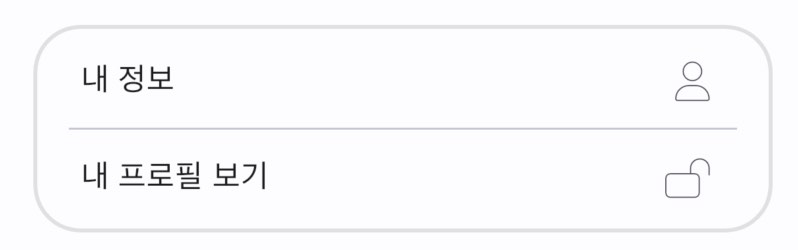 |
CardListView(
  textStyle: Theme.of(context).textTheme.bodySmall,
  items: [
    CardListTile(
      label: 'My profile',
      trailing: const Icon(
        Icons.person,
        size: 20,
      ),
      onTap: () {
        ScaffoldMessenger.of(context).showSnackBar(
          const SnackBar(
            content: Text('My profile'),
          ),
        );
      },
    ),
    CardListTile(
      label: 'View my public profile',
      trailing: const Icon(
        Icons.lock_open,
        size: 20,
      ),
      onTap: () {
        ScaffoldMessenger.of(context).showSnackBar(
          const SnackBar(
            content: Text('View my public profile'),
          ),
        );
      },
    ),
    CardListTile(
      label: 'Whatever menu you like',
      trailing: const Icon(
        Icons.whatshot,
        size: 20,
      ),
      onTap: () {
        ScaffoldMessenger.of(context).showSnackBar(
          const SnackBar(
            content: Text('Whatever menu you like'),
          ),
        );
      },
    ),
  ],
),
Settings UI
You can use CardListView as the UI in setting screen. See the source code of settings.screen.dart in the example.

Theme Design
See Theme Design for details.
Glance of Theme Settings
Sometimes it can be helpful to see at a glance how the theme of the current app (the app you are developing) is set. Copy the code below and paste it in your app. You will see the theme settings like TextTheme or ColorTheme. It is recommended to capture the screen during the development work and save it somewhere where you can quickly refer to it.
ElevatedButton(
  onPressed: () {
    showGeneralDialog(
      context: context,
      pageBuilder: (_, __, ___) => const ThemeScreen(),
    );
  },
  child: const Text("Color theme"),
)